Besides the accent fonts — bannai, ganch, metro, kalam — plates, wayfinding, and forms need a calm workhorse font: strict, official, slightly drafting in style. There is no reason to draw such a font from scratch.
That is why Ipak is a library of two parts. We draw the accent fonts ourselves: they carry a recognizable local motif that no one else has. The workhorse fonts — for plates, wayfinding, and forms — we build on an open base and add an Uzbek layer to it. The first such font is Ipak Davlat.
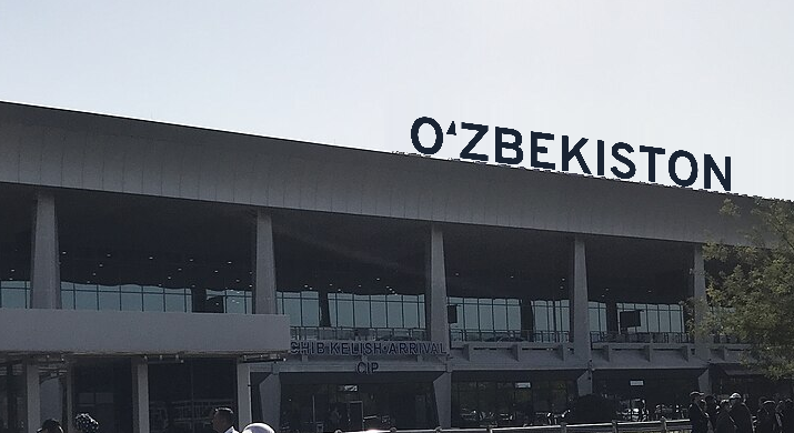
Why a workhorse font is not worth drawing from scratch
A good workhorse grotesque is thousands of glyphs. A glyph is the image of one character in a font: a letter, a digit, an arrow. Each one must be drawn in two weights, its bearings aligned, hundreds of pairs checked. Professional open fonts have already traveled this road: they were made over years and checked by thousands of users.
We add our own only where the base has a gap. For Uzbek there are few such places, but they are in the most visible spot: the ʻ and ʼ signs, the pairs with them, the Cyrillic Ў Қ Ғ Ҳ and its pairs. That is where the work is needed — not in the letter H.
What we were looking for
We wrote the requirements for the base in advance:
- An open license that allows modifying the font and distributing the modified version.
- Full Cyrillic, including the Uzbek Ў Қ Ғ Ҳ. Uzbek is written both in Latin and in Cyrillic, and both turn up on plates.
- The letters of the 2026 law — Ö Ğ Ş Ç. The law has been approved by parliament but, as of 19 October 2026, not signed; the font must be ready in advance.
- Character: strict, “official”, with an engineering dryness.
The ʻ sign was not on the list of requirements. We knew we would draw it ourselves in any case: in the research we did not find a single font where the ʻ is designed as part of the letter rather than as an inverted comma.
How we checked
We took open fonts from Google Fonts and checked two questions. Does the font have the needed characters — this is visible in the file's character table. And how do they look in setting — for this, a line was typeset with the HarfBuzz program, the same one that shapes text in browsers.
The test line: OʻZBEKISTON ЎЗБЕКИСТОН ҚҒҲ ÖĞŞÇ. It contains the Uzbek Latin alphabet with the ʻ sign, Cyrillic, and the letters of the reform.
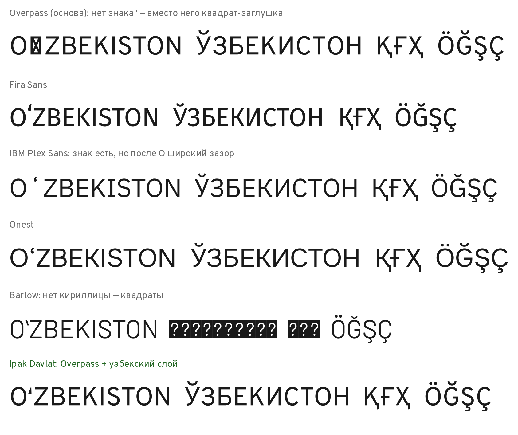
What came out:
| Font | ʻ (U+02BB) | Cyrillic with Ў Қ Ғ Ҳ | Ö Ğ Ş Ç |
|---|---|---|---|
| Overpass | no | yes | yes |
| Fira Sans | yes | yes | yes |
| IBM Plex Sans | yes, but with a large gap | yes | yes |
| Onest | yes | yes | yes |
| Barlow, Public Sans | yes | no Cyrillic | yes |
| Archivo | no | no Cyrillic | yes |
Barlow, Public Sans, and Archivo dropped out at once: they do not have a single Cyrillic letter, not even Ж. Drawing a whole script is exactly what “from scratch” means.
The IBM Plex trap
IBM Plex Sans looked suitable at first glance: it has the ʻ sign. But in setting (our measurement: a file from Google Fonts, October 2026, the sign's width read from the file) the word falls apart: “O ʻ zbekiston”. The sign in this font is very wide — 600 units out of 1000, more than half the size. The size is the font's measure, the nominal height of a line. Around the narrow stroke, two empty fields remain.
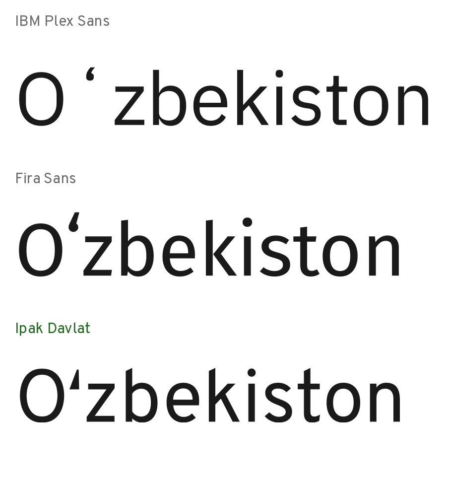
It is exactly this error that the review of Uzbek writing on type.today warns about: the distance between the O or G and the ʻ sign must not be too large, otherwise holes appear in the setting. On a sign a meter wide, such a hole is visible from the other side of the square.
Fira Sans and Onest set the word more evenly. But there too the ʻ is the same inverted comma with its own side bearings, and the pairs O+ʻ and G+ʻ are not kerned. Kerning is a distance correction for a specific pair of letters — for example, so that A and V do not stand too far apart.
Why Overpass
Overpass has no ʻ sign — in the picture a placeholder square stands in for it. But everything else matched the requirements.
Character. Overpass grew out of Highway Gothic, the font of American road signs. Its family was developed in the 1940s at the US road agency that later became the Federal Highway Administration (FHWA). That font's task was to be readable from afar and at speed. Overpass does not copy it: it is an independent text face with several scripts and many weights. Dry straight terminals, open forms, an even rhythm — this is exactly the “slightly drafting style” we were looking for in a workhorse font.
Authors and origin. Overpass was drawn by the Delve Fonts studio: Delve Witherington, Dave Bailey, Thomas Jockin. The project was supported by Red Hat and Google Fonts. It is professional work with open source.
Cyrillic. Complete, with Ў Қ Ғ Ҳ and with proper descender tails on Қ and Ҳ. A descender is the part of a letter that goes below the line, like the tail of Қ.
The reform letters. Ö Ğ Ş Ç are already in place.
The absence of ʻ we did not count as a minus. We would have drawn our own sign in any case: with Overpass we simply did not have to fight someone else's.
The OFL license in brief
Overpass is distributed under the SIL Open Font License 1.1 (in the version from Google Fonts). The OFL allows modifying the font and distributing the modified version, including together with programs. The terms are simple: a derivative font stays under the same license, the copyright of the base authors is preserved, and the font itself cannot be sold separately, on its own.
So each Ipak Davlat file carries two copyright lines: those of the Overpass authors and those of the Uzbek-layer authors. Next to the fonts lies the license text with both lines. Ipak Davlat is released under SIL OFL 1.1, with the copyright of the Overpass authors preserved. Overpass's license has no Reserved Font Name; and the derivative font has its own name anyway — Ipak Davlat. For questions about rights, write to avenex@xronocode.com.
What the “Uzbek layer” is
We call the layer everything added on top of Overpass. Each part is covered in detail in separate articles of this section.
- Our own ʻ and ʼ signs. A wedge with straight cuts. The ʻ has its heavy end at the bottom, the ʼ at the top. They are easy to tell apart even at small sizes.
- Kerning with the signs. The “mark band” method: the gap is measured only where the sign stands. This is the article “The mark band”.
- Cyrillic kerning. The base had almost no corrections for ГЛ, ТЛ, УА, and none at all for Қ Ғ Ҳ. We cross-checked against five professional open fonts: Fira Sans, Inter, Noto Sans, Onest, IBM Plex Sans. We took from them not the values but how tightly they set each pair. The result: 784 pairs in Regular and 802 in Bold.
- Substitution of typed quotation marks. A person types o'zbek on an ordinary keyboard — the font shows oʻzbek. This is the article “o' → oʻ”.
- Details for plates: an l with a tail, a slashed zero, arrow pictograms, a fixed middle dot. This is the article “A sign read from a distance”.
How it turned out
The base saved months. But the “Uzbek layer” was no trifle: when Ipak Davlat was checked, almost all the comments concerned exactly what had been added — the signs, the pairs, the substitution. The base's letter H never raised a single question.
The conclusion for anyone making a font for Uzbek: you do not have to draw everything. What matters is finding a base with good Cyrillic and a fitting character, and spending your effort on what sets Uzbek typesetting apart from any other.
Sources
- The Overpass repository: the descent from Highway Gothic, the authors, the support of Red Hat and Google Fonts — github.com/RedHatOfficial/Overpass.
- Highway Gothic and the list of derivative fonts, including Overpass — Wikipedia.
- The Overpass copyright and license in Google Fonts — the OFL.txt file.
- The terms of SIL OFL 1.1 — openfontlicense.org.
- The advice about the gap between O/G and ʻ — А. Шайдуллина, type.today, 04.12.2023.
- The names and numbers of the characters U+02BB, U+02BC — the Unicode charts.
- The coverage and typesetting check is our own measurement: font files from github.com/google/fonts (18 October 2026), the character table read with fontTools, the test line set with HarfBuzz.
Links:
- Overpass — the project repository (Red Hat, Delve Fonts). https://github.com/RedHatOfficial/Overpass
- Highway Gothic — Wikipedia. https://en.wikipedia.org/wiki/Highway_Gothic
- Overpass in Google Fonts: the OFL license file. https://raw.githubusercontent.com/google/fonts/main/ofl/overpass/OFL.txt
- SIL Open Font License 1.1 — the official text. https://openfontlicense.org/open-font-license-official-text/
- А. Шайдуллина. Uzbek. type.today, 04.12.2023. https://type.today/en/journal/uzbek
- Unicode: Spacing Modifier Letters (U+02B0–U+02FF). https://www.unicode.org/charts/PDF/U02B0.pdf
- Google Fonts: requirements for the Uzbek Latin alphabet (uz_Latn). https://github.com/googlefonts/lang/blob/main/Lib/gflanguages/data/languages/uz_Latn.textproto
- Fira Sans. https://github.com/mozilla/Fira
- IBM Plex. https://github.com/IBM/plex
- Onest. https://github.com/simpals/onest
- Barlow. https://github.com/jpt/barlow
- Wikimedia Commons: a photo of Tashkent Airport for the mockup (Alpasli, CC BY-SA 4.0). https://commons.wikimedia.org/wiki/File:Toshkent_xalqaro_aeroporti_binosi_24.jpg
