In this section we tell how Ipak is made. Not just what came out in the end, but how we got there: where the letter shapes came from, where we went wrong, how we checked the work, and why we made this or that decision. Each article draws on the project's research, its checks, and the fonts themselves. Where a fact has no source, we say so.
The section is for everyone interested in the letters on the streets of Uzbekistan: designers, editors, sign makers, museum and institution staff, and the simply curious.
How the project went
1. Research
We started on the street: we took apart 17 buildings and signs in Tashkent and other cities — the airport, the railway stations, the Uzbekistan Hotel, Chorsu, the metro. We looked at which fonts the inscriptions were set in and where the ʻ sign breaks. Separately, we studied the ʻ sign in law and in Unicode, the two Latin alphabets, and the sources of form — from bannai to Yanalif.
2. Concepts
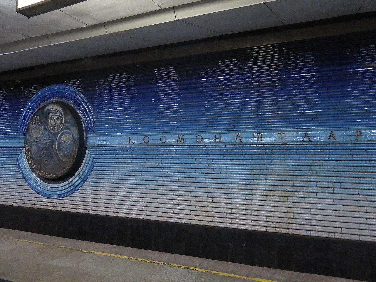
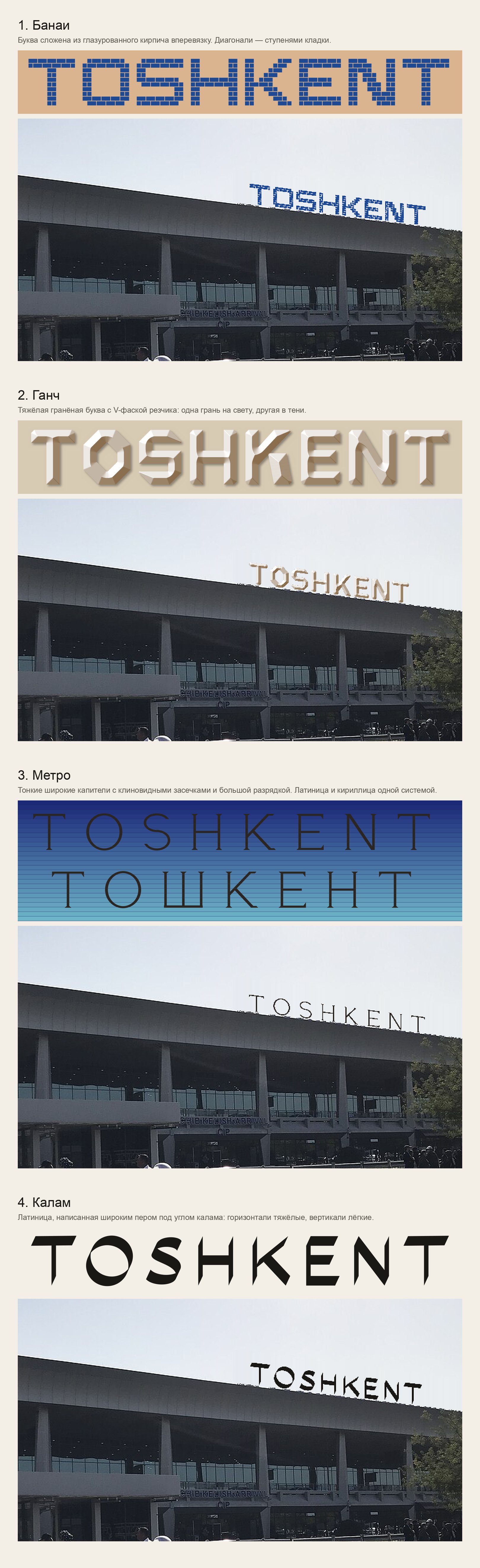
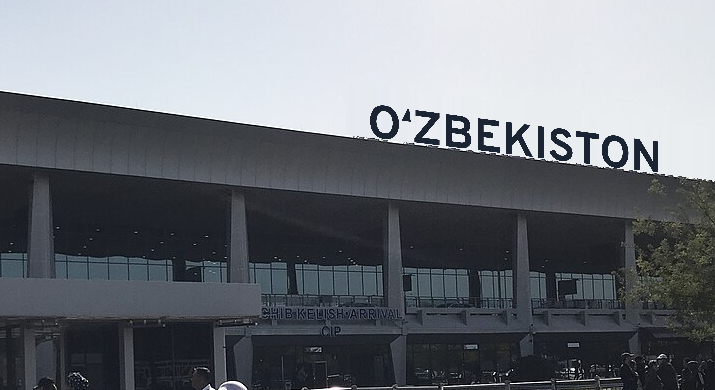
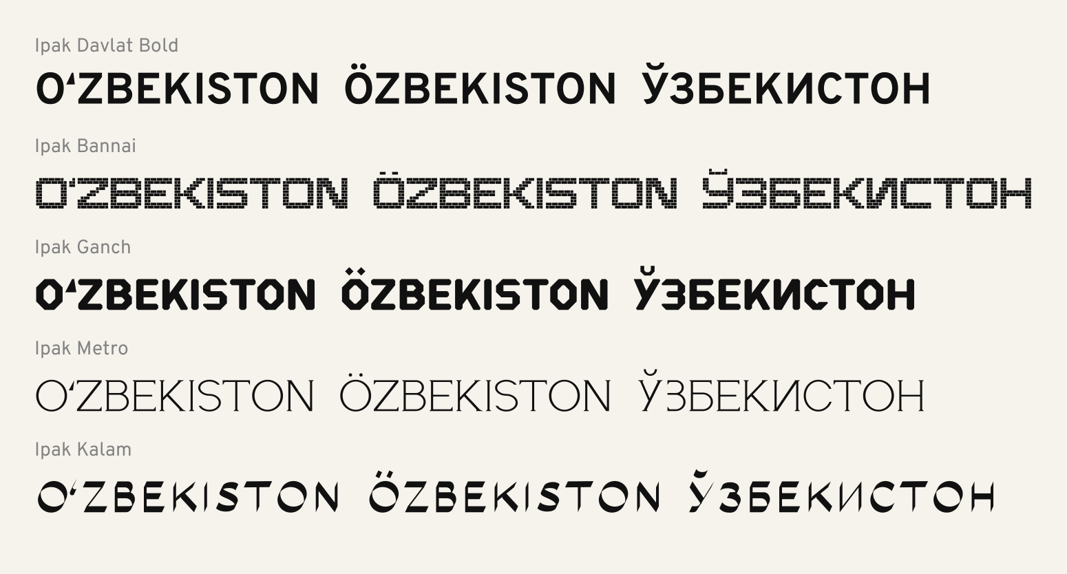
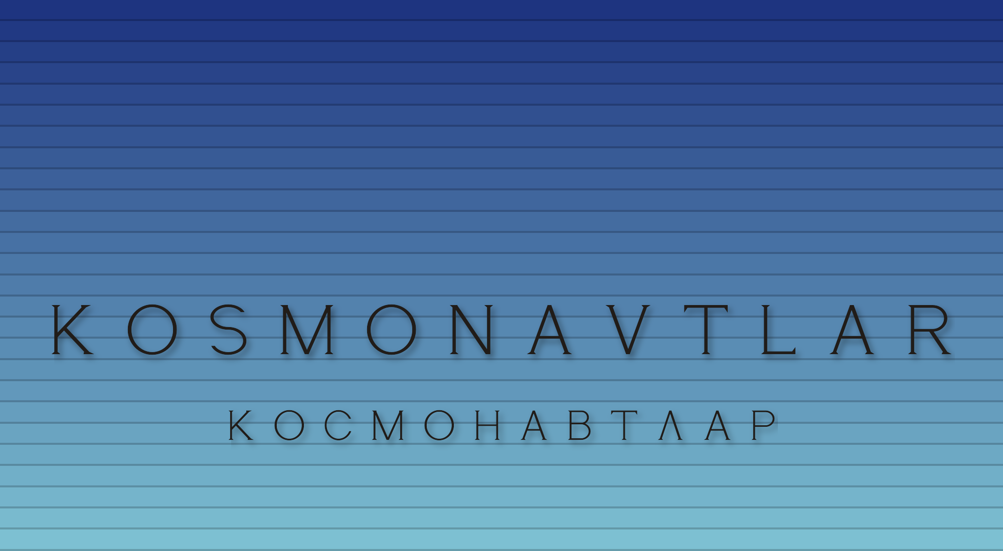
Accent fonts begin not with letters but with a motif that is recognized at first glance. We ended up with four concepts, each with a recognizable motif: bannai — brickwork laid in a running bond, ganch — a faceted letter with a carver's chamfer, metro — thin, wide capitals like the ones at Kosmonavtlar, kalam — the trace of a broad pen. Each concept was tested on photos of Tashkent Airport.
3. Ipak Davlat
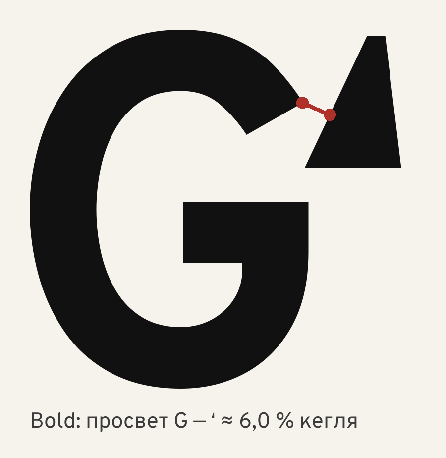
Official inscriptions and signage need a calm workhorse font, and there is no reason to draw one from scratch. We compared open fonts on their Uzbek signs and chose Overpass. On top of it we built an Uzbek layer: our own ʻ and ʼ, alignment of Oʻ and Gʻ, Cyrillic kerning with Ў Қ Ғ Ҳ (kerning — corrections to the distance between specific pairs of letters), the letters Ö Ğ Ş Ç, sign substitution as you type, and variants for plates.
4. Checking
A font is released after two clean independent checks in a row. Ipak Davlat was checked automatically (Font Bakery, OTS) and from four sides — typography, the Uzbek language, signage, engineering and licensing. The most serious errors turned out to be consequences of our own fixes; a test on real words protects against their return.
5. The library
Ipak became a library of two kinds of fonts. The workhorse fonts are built on an open base with an Uzbek layer; the accent fonts — Bannai, Ganch, Metro, Kalam — we drew ourselves from local motifs. Every font includes the 1995 Latin alphabet, the letters of the 2026 law, and Cyrillic with Ў Қ Ғ Ҳ.
6. The portal
The fonts are available free of charge at ipak.xronocode.com under the open SIL Open Font License 1.1 (OFL): they can be freely used, modified, and redistributed. Each font has its own page: samples, usage scenes, the character set, and a downloadable archive. The portal runs in six languages: Uzbek, Russian, English, Spanish, Portuguese, and Chinese.
Articles
History and context
- Four scripts in a hundred years — Arabic script, Yanalif, Cyrillic, and the Latin alphabet together with the 2026 law: why a font for Uzbekistan has to handle all of them at once.
- The ʻ sign: what the law says and what Unicode says — why the shape of the sign is a designer's decision, not a requirement of the law.
- What hangs on the streets of Tashkent — 17 buildings and signs: which fonts they are set in and where the ʻ breaks.
- The lettering of the Tashkent metro — Soviet and post-Soviet lettering styles, and what they lack for Uzbek.
Form
- Bannai, ganch, kalam: where the form comes from — three traditional crafts and how each one became a font.
- From code to font — how the accent fonts are built with code: the brick grid, the chamfer and the light, wedge serifs, the broad pen, file assembly, and kerning by measurement.
The workhorse font
- Why not from scratch — workhorse fonts on an open base: how the base was chosen and what the OFL license gives.
- The mark band: aligning Oʻ and Gʻ — why GʻA kept sinking and how it was fixed.
- o' → oʻ: a substitution that knows Uzbek — how the font itself puts the right sign in place of the quote mark you typed.
- A sign read from a distance — I and l, O and 0, the middle dot, arrows, and testing at small sizes.
Process and quality
- How a font is checked — Font Bakery and OTS, four directions of checking, a substitution test on real words, and measurement instead of judging by eye.
- The alphabet changes — the sign stays — why, when moving to Ö Ğ Ş Ç, only the letters that changed need to be reset.