Before drawing a font for signs, we looked at what is already on them. The survey covers 17 sites. Mostly Tashkent, plus, for comparison, the airport and railway station of Samarkand and a hokimiyat in the Surkhandarya region. Airports, railway stations, a hotel, a ministry, a bazaar, a metro station, a street sign.
A word about the method first. All photos are taken from freely licensed Wikimedia Commons images; the authors and licenses are given under each picture. The font names are our eyeball estimates. For not a single building did we find a document naming the font. That is why we write “similar to” and “looks like” rather than “this is Helvetica”.
Railway stations and airports: a font on top of the building
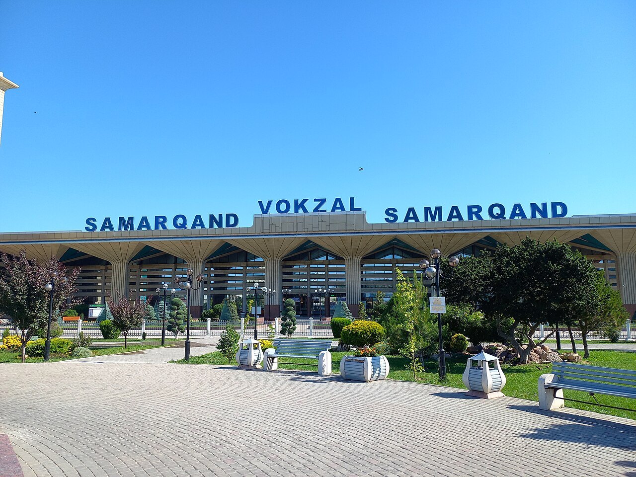
The most vivid example is the Samarkand railway station. Above the long canopy with fan-shaped columns stand blue three-dimensional letters: SAMARQAND · VOKZAL · SAMARQAND. The font is a bold grotesque very similar to Arial Bold or Helvetica Bold: an R with a straight leg, a Q with a short tail. In a 2011 photo the inscription is different: light-blue letters of a different shape [4]. The font was changed along with the sign.
The Tashkent railway station is the same story. The 1899 building was rebuilt in a modernist style in 1957–1961 and rebuilt twice more in the years of independence [2]. Today on the roof there is a dark-blue grotesque: TOSHKENT · VOKZAL · TOSHKENT. In a 2011 photo the letters are noticeably wider and of a different color [3]. There is no single standard: each new sign brings a new font.
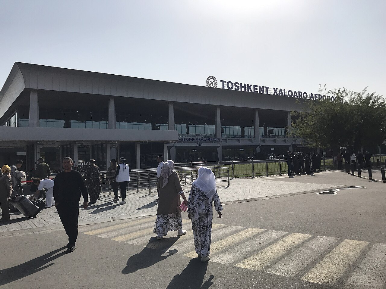
Above the terminal of Tashkent Airport is TOSHKENT XALQARO AEROPORTI, a geometric grotesque with an almost circular O. The letters stand on a frame above the roof. And at the same entrance, a granite stele with an inscription in three languages is set in a serif font that looks like Times. Two unrelated fonts at the same door.
Government buildings, and English instead of Uzbek
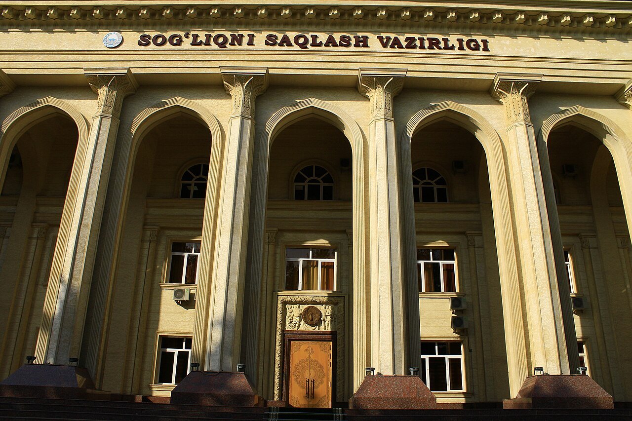
On the frieze of the Ministry of Health is SOGʻLIQNI SAQLASH VAZIRLIGI, in dark-red letters. The size is fitted to the frieze, and that is good. But the wide “advertising” font with small serifs looks alien next to the pointed arches. On the district hokimiyat in Denau — HOKIMIYAT in a bold serif font very similar to Times New Roman Bold. A decision straight out of Word.
A separate topic is English. On the Uzbekistan Hotel (1974, one of the symbols of Tashkent modernism [5]), HOTEL UZBEKISTAN runs along the cornice in wide serif capitals. There is no Uzbek name “Oʻzbekiston” on the roof. The new terminal of Samarkand Airport is labeled in English only — and as “Samarkand”, not “Samarqand”. In the Tashkent City park — TASHKENT CITY in a high-contrast “fashionable” font without local character.
Chorsu: three fonts on one canopy
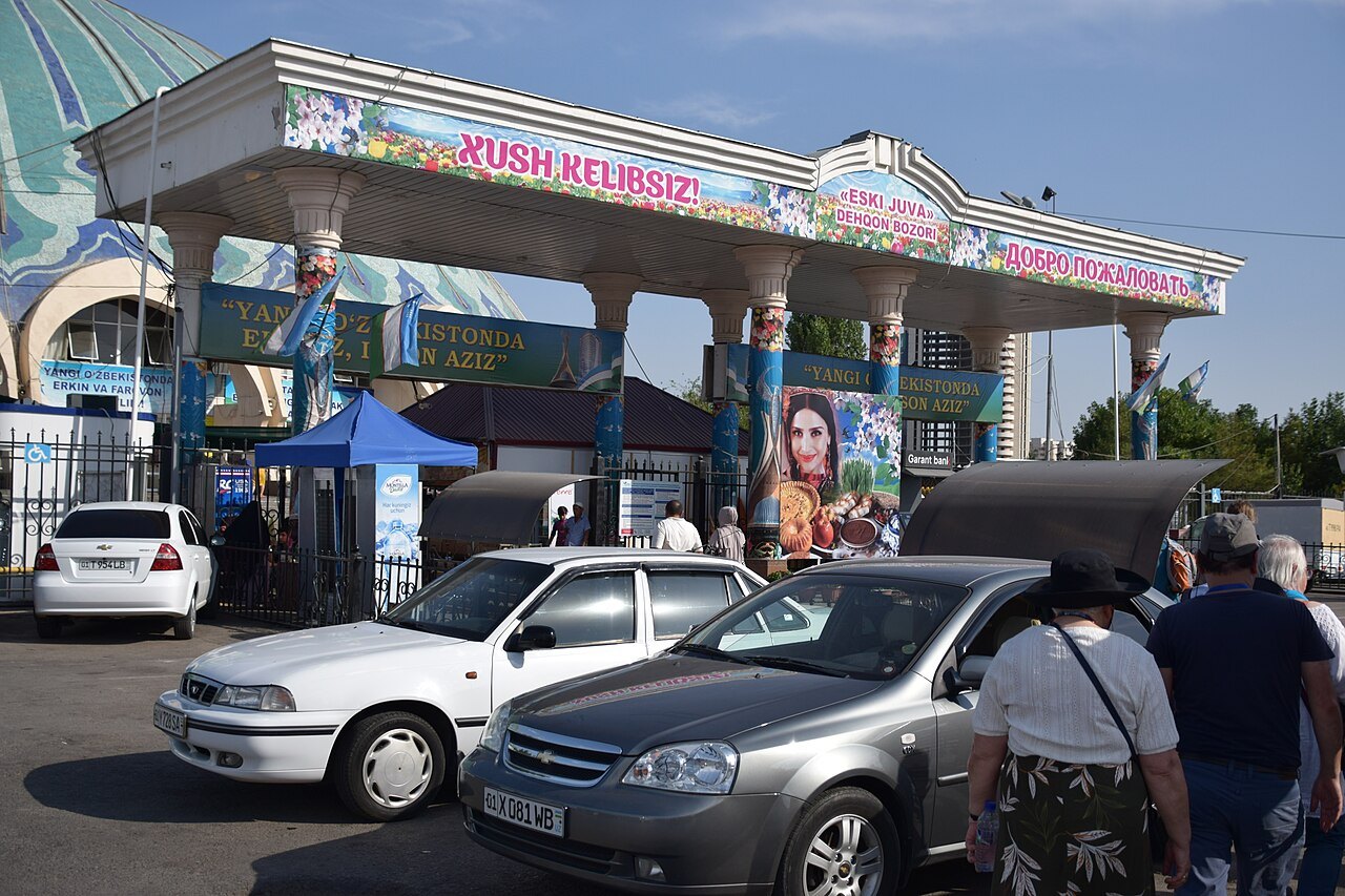
The dome of the Chorsu Bazaar was designed in 1980 [6]. In July 2026 the bazaar became part of the UNESCO World Heritage site “Tashkent Modernism” [7]. And on the canopy of the main entrance: XUSH KELIBSIZ!, «ESKI JUVA» DEHQON BOZORI, and ДОБРО ПОЖАЛОВАТЬ. Three different fonts, two scripts, outlines, and a floral background. The entrance has no connection whatsoever with the turquoise dome next to it.
Where it works
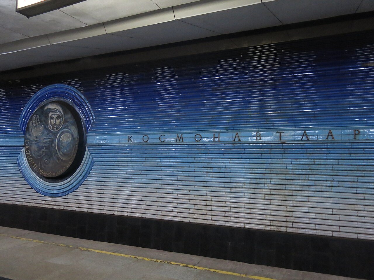
There were good examples too. On the platform of the Kosmonavtlar station, the name is set in thin, wide capitals with generous letterspacing. The metal letters are mounted directly on the blue ceramics, in line with the medallions [8]. The inscription does not argue with the wall; it becomes part of the décor. More on this in the article “The lettering of the Tashkent metro”.
The slab by the Center of Islamic Civilization also looks good. Golden letters with flaring strokes and sharp terminals, as in carved fonts, go well with the gray granite. There is one weak spot: the ʻ sign in OʻZBEKISTONDAGI has the right shape but is too small.
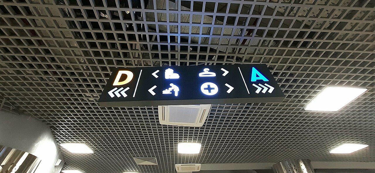
The Palace of Peoples' Friendship and the Panorama cinema manage without large inscriptions at all: the buildings are recognized by the sculptural quality of their façades. And in Humo Arena the wayfinding works almost without words: the section letters and pictograms are clear both to an Uzbek and to a tourist [9].
Where the ʻ breaks
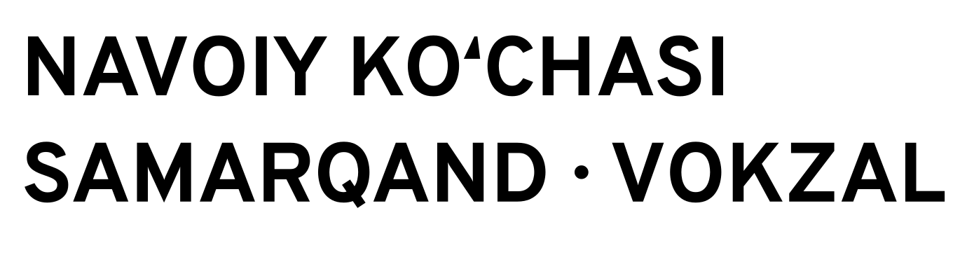
We expected to see the straight apostrophe instead of ʻ on signs. No freely licensed photos of such signs turned up. At all the sites in the survey that have Oʻ or Gʻ, the sign has the correct “6” shape. The problems are different: on the granite slab of the Center of Islamic Civilization the sign is small and gets lost; on the NAVOIY KOʻCHASI street sign it is squeezed in between O and C; and from sign to sign it changes size and place.
In typeset text, however, the confusion is widespread. Our measurement on the open map of OpenStreetMap (18 October 2026, counting objects within the boundaries of Tashkent by their Uzbek name through the Overpass API service): about 88% of names with Oʻ and Gʻ are typed with the straight apostrophe, and the correct sign appears in about 7% [11]. Another measurement of ours — the home pages of eight large websites, government, city, and news ones, on the same day: after O and G, from two to four different signs appear on a single page. That is digital text, not street signs: in the survey photos of signs, the sign has the correct shape everywhere. A Kun.uz journalist writes that mistakes on street signs are “beyond counting” [10]. Most likely, the straight apostrophe lives more often on shop and café signs, but we will only verify that with field photography.
What this means for the font
The survey produced a list of requirements for Ipak:
- One font for the whole building. The roof inscription, the stele, and the wayfinding inside — in one typeface.
- Latin and Cyrillic — one family. Where both scripts are present, they must not look like two different fonts.
- The ʻ sign as part of the letter. Close to the O and G, large, the same on every plate.
- Simple shapes for three-dimensional letters. No fine details that will disappear in metal or in a light box.
- A local but restrained character. The font must get along both with the ornament of a railway station and with modernist concrete.
- Pictograms and arrows with the same line weight, as in Humo Arena.
Ipak Davlat answers the first three points directly: its Latin, Cyrillic, and the letters of the 2026 law share one weight and proportions, and it has its own ʻ and ʼ signs and arrow pictograms. The character for a particular building comes from the library's accent fonts.
Sources
- Wikipedia: Tashkent International Airport. https://en.wikipedia.org/wiki/Tashkent_International_Airport
- Hokimiyat of the Shaykhantakhur District: the railway station. https://shayxontohur.tashkent.uz/en/city/interesting-places/85
- Commons: Tashkent Station, 2011 (Bobyrr, CC BY-SA 4.0). https://commons.wikimedia.org/wiki/File:Tashkent_Station.JPG
- Commons: Railway station in Samarkand, 2011 (Bobyrr, CC BY-SA 4.0). https://commons.wikimedia.org/wiki/File:Railway_station_in_Samarkand_2011.jpg
- Koryo Group: Hotel Uzbekistan. https://koryogroup.com/blog/discovering-the-grandeur-of-the-hotel-uzbekistan-a-jewel-of-tashkent-s-history
- Wikipedia: Chorsu Bazaar. https://en.wikipedia.org/wiki/Chorsu_Bazaar
- Euronews, 02.08.2026. https://www.euronews.com/2026/08/02/grand-designs-tashkents-modernist-architecture-joins-unesco-world-heritage-list
- Wikipedia: Kosmonavtlar (Tashkent Metro). https://en.wikipedia.org/wiki/Kosmonavtlar_(Tashkent_Metro)
- Wikipedia: Humo Arena. https://en.wikipedia.org/wiki/Humo_Arena
- Kun.uz, 27.09.2023. https://kun.uz/news/2023/09/27/lotin-yozuvini-takomillashtirish-muammoli-4-ta-harf-nega-ozgartirilmoqda
- Our own measurement: OpenStreetMap via Overpass API (a service for querying map data), 18.10.2026 (data © OpenStreetMap contributors, ODbL). https://overpass-api.de
- Wikimedia Commons: Samarkand railway station (DS28, CC BY-SA 4.0). https://commons.wikimedia.org/wiki/File:Samarkand_railway_station._June_2022.jpg
- Wikimedia Commons: Tashkent Airport (Alpasli, CC BY-SA 4.0). https://commons.wikimedia.org/wiki/File:Toshkent_xalqaro_aeroporti_binosi_24.jpg
- Wikimedia Commons: Chorsu Bazaar entrance (Jean Housen, CC BY-SA 4.0). https://commons.wikimedia.org/wiki/File:20230606_Tashkent166.jpg
- Wikimedia Commons: Ministry of Health (Humoyun Mehridinov, CC BY-SA 4.0). https://commons.wikimedia.org/wiki/File:Sogʻliqni_Saqlash_vazirligi_binosi_01.jpg
- Wikimedia Commons: Kosmonavtlar station (Enric, CC BY 4.0). https://commons.wikimedia.org/wiki/File:108_Estació_de_metro_Kosmonavtlar_(Taixkent).jpg
- Wikimedia Commons: Humo Arena wayfinding signs (Mysportedit, CC BY-SA 4.0). https://commons.wikimedia.org/wiki/File:Указатели_в_Humo_Arena_(2).jpg


