The easiest way to draw an “eastern” font is to add swirls, pointed arches, and tails like those of Arabic letters. Such a font is recognized at once and gets tiresome just as fast. There is a second problem too: many historical inscriptions of Uzbekistan are sacred texts. Imitating them in Latin is disrespectful.
So Ipak takes from tradition not the pattern but the way of working. How does a master build a letter? What is it made of? What is it cut or written with? Three accent fonts grew out of the three answers: Ipak Bannai, Ipak Ganch, and Ipak Kalam. Below is a short account of each craft's history and of what passed from it into the font.
Bannai: a letter made of brick
Bannai is a way of finishing a wall in which glazed brick alternates with plain. From the colored bricks a geometric pattern or an inscription is assembled. The Persian word is translated as “the builder's technique”. The craft matured under the Seljuks and the Timurids. The relief variant, in which bricks protrude and recede, is called hazarbaf — “a thousand weavings”: the wall resembles fabric (Wikipedia, “Banna'i”).
There are many examples in Uzbekistan. On the Ulugh Beg madrasa in Bukhara (1417–1420), blue glazed brick forms the names of Muhammad and Allah in square kufic. Researchers at Leiden University write that such inscriptions “could be read from afar” and that they emphasized the scale of the building (Leiden Iran-Turan). In Samarkand, a similar inscription runs around the drum — the wall under the dome — of the Bibi-Khanym mosque (Glendale College). On the minaret of Gur-e-Amir (1403–1404) the word “Allah” is built of brick (Wikipedia, “Gur-e-Amir”; the file description on Commons).
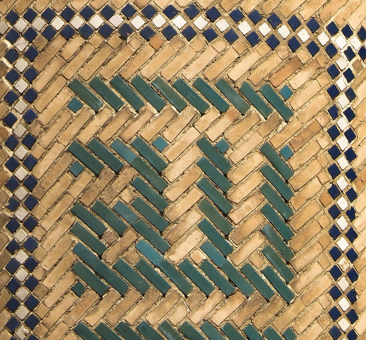
What Ipak took. The main idea of bannai is the module. A letter is not drawn; it is assembled from identical bricks. In Ipak Bannai a capital letter takes up 10 courses of brickwork. The stroke is two courses, or two cells; the counter inside the letter is no less than two. This rule is taken straight from the purpose of bannai: if the counter is not narrower than the stroke, the letters do not merge at a distance.
The bricks are laid in a running bond, as in a real wall: in each next course the joints are shifted by half a brick. The diagonal lines — in K, N, Z — run in the steps of the brickwork, not as an even slope. The result is a Latin alphabet that looks laid rather than drawn.
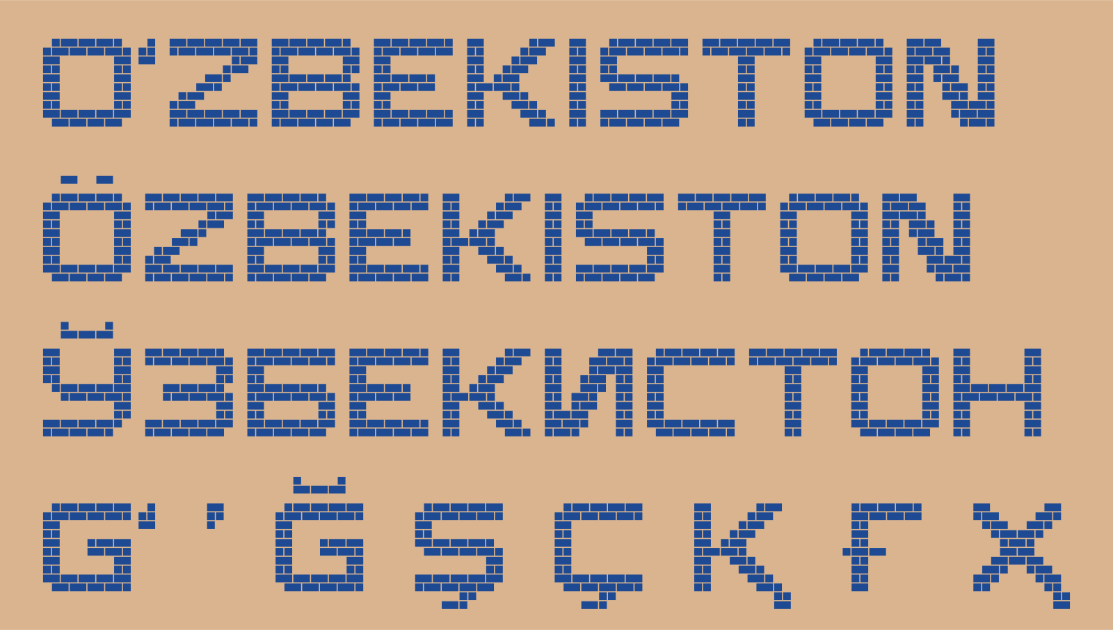
Bannai has a danger. A purely square Latin alphabet easily turns into a “computer” pixel font. So Bannai remained an accent font for large inscriptions. It is not meant for text and plates.
Ganch: a letter cut with a knife
Ganch is carved plaster based on gypsum (Ismailova, San'at, 2008). The carver works in two layers. The lower layer hardens quickly. The upper one stays soft for a long time: the design is drawn on it and cut out with knives and scrapers. Then the pattern is often painted (centralasia-travel.com). The main kinds of pattern are islimi (plant stems and spirals) and girih (geometry) (centralasia-travel.com).
The tradition is very old. At the Varakhsha palace near Bukhara, the expedition of V. A. Shishkin found several thousand fragments of carved ganch under the sand in the 1930s–1950s. There the figures are in places carved in high relief, almost sculpture. Part of the finds is kept today at the State Museum of History of Uzbekistan in Tashkent; two restored panels are on display there (Ismailova, San'at, 2008). In the twentieth century the centers of carving were Khiva, Bukhara, Tashkent, Samarkand, and the cities of the Fergana Valley.
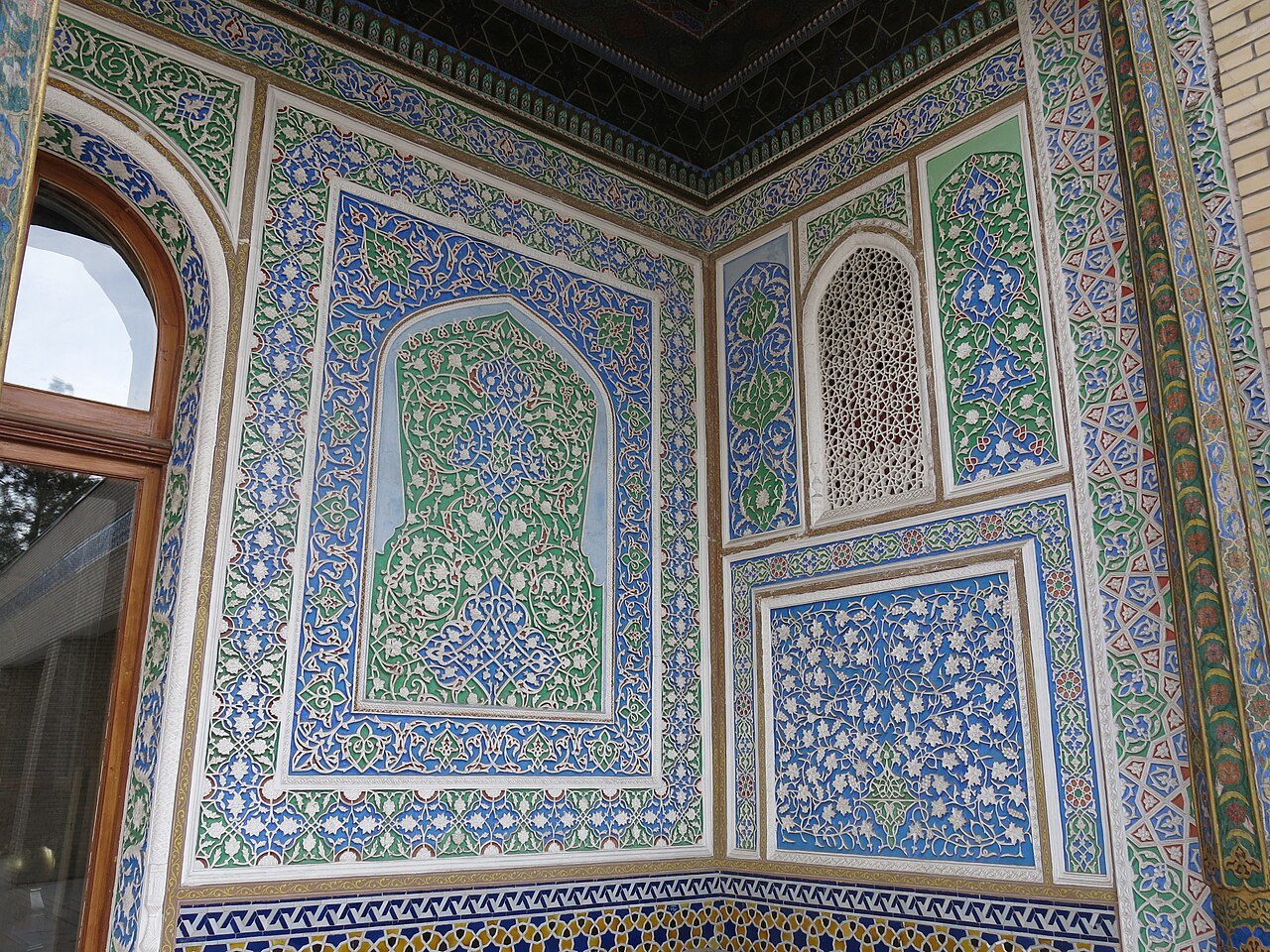
We did not find a separate term for stroke endings in ganch in the sources. What follows is our conclusion from photographs, not a description from the literature. The knife leaves a sloped wall in the soft plaster — a chamfer. In the sun, one face of such a recess is light and the other dark. The pattern is read not by color but by light.
What Ipak took. Ipak Ganch is a heavy faceted letter. The “round” letters — O, C, G, Q — became octagons. On the outer corners — straight and sharp — the point is cut off, as if the carver had knocked it away: by 40 units along each side, which at a right angle is a cut at 45°. The inner corners stay sharp: that is where the knife goes in.
The volume is made like a V-cut: from the edges of the stroke the walls converge to a ridge in the middle. The light falls from the upper left, so one side of the ridge is light and the other is in shadow. The relief is not drawn by hand for each letter. A program computes it from the outline itself, and it works for any character, including ʻ, Ў, and Ş.
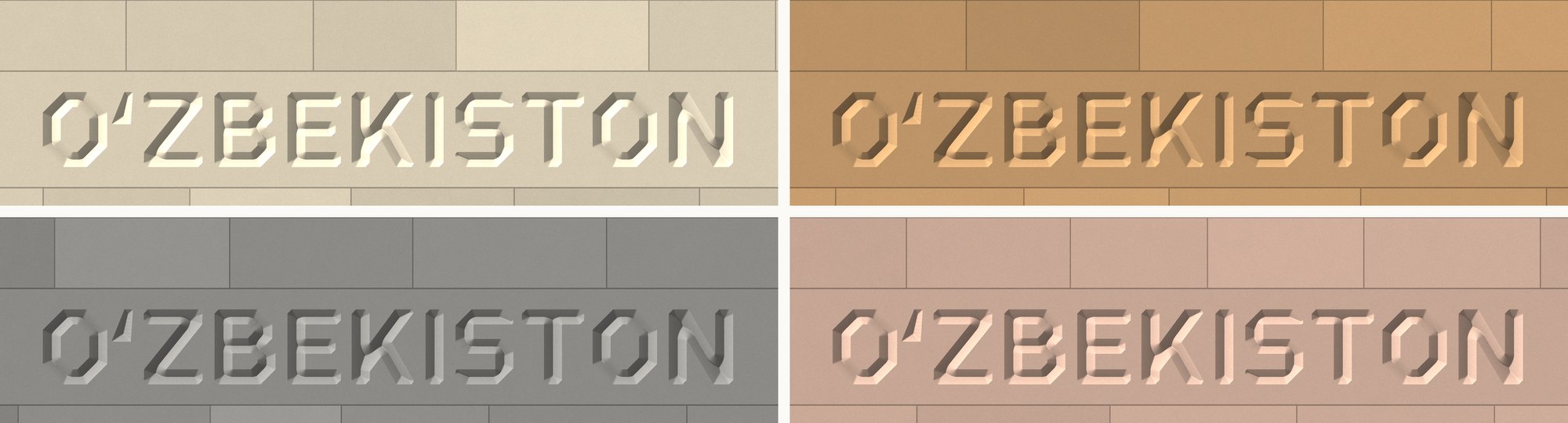
We decided to show Ganch not on a building but on stone walls in four shades. This makes the main device visible: an inscription can be cut into stone or cast as three-dimensional letters, and the design holds by light, not by paint.
Kalam: a letter written with a pen
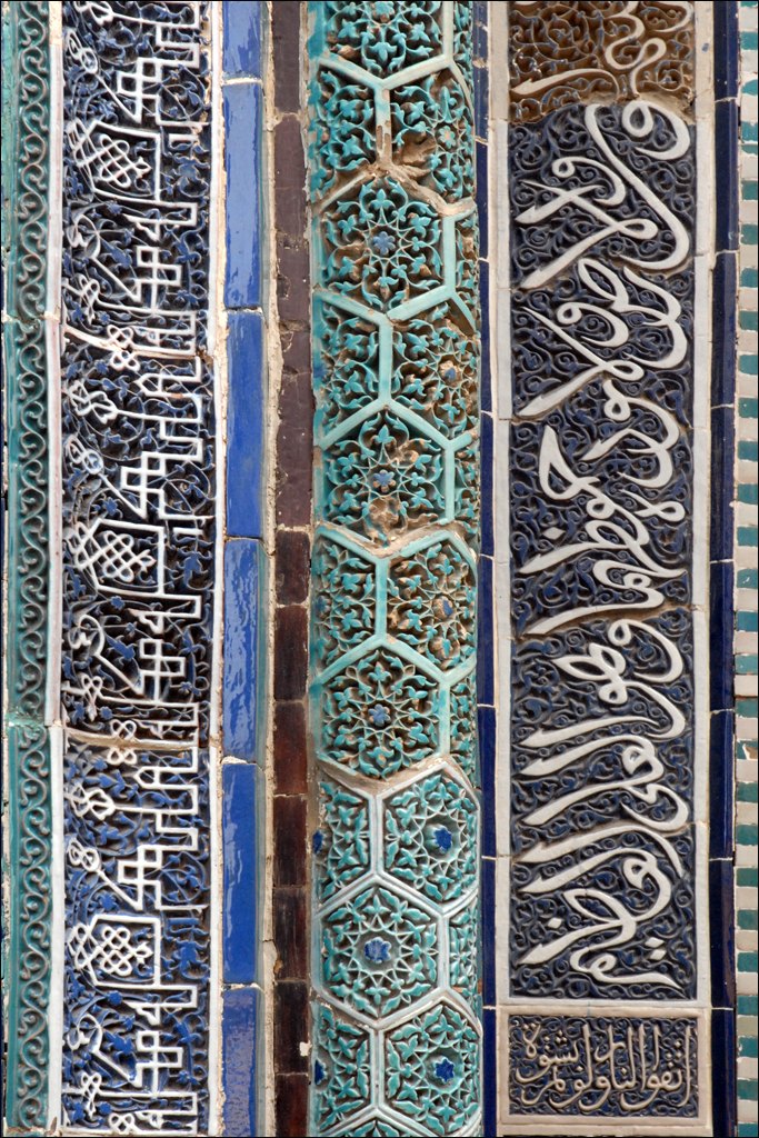
A kalam is a pen cut from dry reed. Its tip is cut at an angle that depends on the hand (Wikipedia, “Qalam”). The width of the cut sets the size of the writing. In the tenth century in Baghdad, a system of “proportioned writing” took shape, associated with the name of the vizier Ibn Muqla. Letters were measured by three quantities: the size of the nuqta dot, the height of the alif letter, and the circle with the diameter of the alif (Wikipedia, “Ibn Muqla”). The thuluth hand — large and ceremonial — has for many centuries been used for inscriptions on mosques and for the headings of the surahs of the Quran (Wikipedia, “Thuluth”).
At the entrance of the 1360–1361 mausoleum in the Shah-i-Zinda ensemble, a Quranic text runs in thuluth around the perimeter of the portal opening: white letters on a dark-blue background (society.uz).
What Ipak took. Ipak Kalam is written with a single broad pen. The pen is a segment 150 units wide (with a capital height of 700; a unit is one thousandth of the font size) held at 65° to the line. At that angle the horizontals come out heavy and the verticals light. This is the contrast of Arabic script transferred to Latin and Cyrillic. All the characters — letters, the dots over Ö and Ё, digits, quotation marks — are written with the same pen.
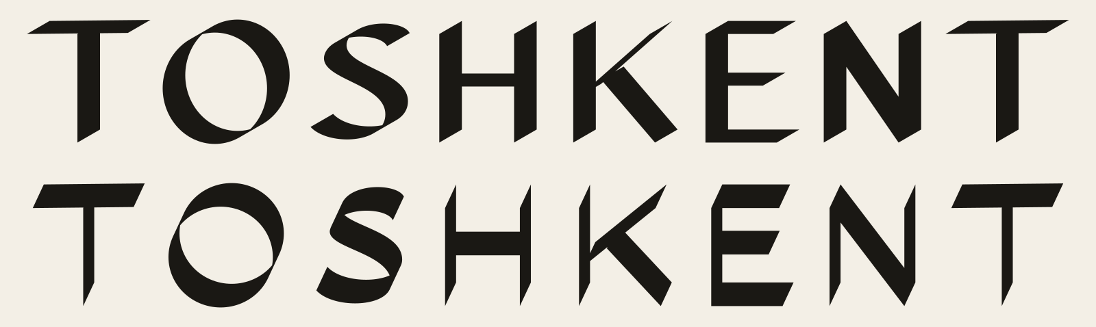
The 65° figure is our own choice, not a quotation. In open sources we found figures of 30–40°. But there the subject is the cutting angle of the pen, and it is not said from which line it is measured. We compared the variants on the same word. At 30° the word looks like an ordinary Latin italic without slant. At 65° — like a Latin word written by a calligrapher used to the Arabic pen.
A large angle has a price. If a stroke runs almost along the tip of the pen, it becomes thin as a thread. So the diagonal lines in Kalam are tuned to deviate from the pen angle by at least 9–10°. Then the thinnest line is no narrower than 25 units and does not disappear on a sign.
What we do not take
We do not imitate Arabic letters in Latin. The thuluth and kufic on the monuments are, above all, texts, and many of them are sacred. We take only the principles: brick as module, knife as chamfer, pen as the source of contrast. Ornament — islimi, girih, suzani rosettes — does not pass into the letters themselves.
The result
Three crafts gave three systems. Bannai — the grid: a letter is assembled from bricks by a rule. Ganch — light: a letter is read thanks to the chamfer and the shadow. Kalam — contrast: the thickness of the stroke is set by the direction of the pen, not by the artist.
Each system works for any letter, not just for the word on the sketch. That is why Ipak Bannai, Ipak Ganch, and Ipak Kalam became full capital-letter fonts: Latin, Cyrillic with Ў Қ Ғ Ҳ, the 2026-law letters Ö Ğ Ş Ç, the ʻ and ʼ signs, digits, and punctuation. The fourth accent font, Ipak Metro, grew out of the lettering of the Tashkent metro — it has an article of its own. How programs draw these letters, and how the pictures became real font files, is told in the article “From code to font”.
Sources
- Wikipedia: “Banna'i”, “Gur-e-Amir”, “Qalam”, “Ibn Muqla”, “Thuluth”.
- Leiden University, Iran-Turan — the Ulugh Beg madrasa in Bukhara.
- Glendale Community College — the Bibi-Khanym mosque.
- M. Sakkal, Journal of Mathematics and the Arts, 2018. The full text is behind a paywall; we have not seen the exact proportions of the grid.
- centralasia-travel.com and encyclocraftsapr.com — ganch carving.
- J. Ismailova, San'at magazine, 2008, No. 3 — Varakhsha.
- society.uz — the epigraphy of Shah-i-Zinda.
- TypeDrawers — a discussion of contrast in Arabic script (the opinion of practitioners, not a scholarly source).
Links:
- Wikipedia: Banna'i. https://en.wikipedia.org/wiki/Banna'i
- Leiden Iran-Turan: Ulugh Beg Madrasa (Bukhara). https://iranturan.leiden.edu/ulugh-beg-madrasa/
- Glendale Community College: Masjid-i-Jami (Bibi-Khanym), Samarkand. https://gcc.glendale.edu/ceramics/fridaymosque.html
- M. Sakkal. Intersecting squares: applied geometry in the architecture of Timurid Samarkand. Journal of Mathematics and the Arts, 2018. https://doi.org/10.1080/17513472.2018.1468178
- Wikipedia: Gur-e-Amir. https://en.wikipedia.org/wiki/Gur-e-Amir
- Crafts of Uzbekistan: Ganch carving (centralasia-travel.com). https://www.centralasia-travel.com/en/publication/ganch
- J. Ismailova. Gypsum Decor from the Varakhsha Palace: the Issue of Reconstruction. San'at, 2008, № 3. https://sanat.orexca.com/2008/2008-3/jannat_ismailova-2/
- Ganch carving (encyclocraftsapr.com). https://encyclocraftsapr.com/ganch-carving/
- society.uz: the epigraphy of Shah-i-Zinda (entrance of the 1360–1361 mausoleum). https://society.uz/news/detail/news/1479
- Wikipedia: Qalam. https://en.wikipedia.org/wiki/Qalam
- Wikipedia: Ibn Muqla. https://en.wikipedia.org/wiki/Ibn_Muqla
- Wikipedia: Thuluth. https://en.wikipedia.org/wiki/Thuluth
- TypeDrawers: Optical correction in Arabic monoline (a discussion of contrast in Arabic script). https://typedrawers.com/discussion/comment/26417