Ipak Davlat is the Ipak library's workhorse font. It is built on the open font Overpass, to which an Uzbek layer was added: the ʻ and ʼ signs, Cyrillic kerning with Ў Қ Ғ Ҳ, the letters Ö Ğ Ş Ç, variants for plates. Before the font is published, it is checked. Below is what exactly is checked, why, and how.
The release rule
The font is released only when two independent checks in a row find nothing that needs fixing. If something was fixed after a check, the next one starts from zero.
Not every comment blocks the release. “For the future” wishes are recorded separately and move to the next version. Only an error blocks it, without which the font cannot be released: a wrong sign, letters sticking together, a broken build.
Automatic checks
First the font is run through programs. They do not judge beauty, but they do not miss technical errors.
- Font Bakery is an open set of font checks: names and metrics in the file, the presence of the needed characters, the correctness of tables. For Ipak Davlat, the comments that remain relate to the Overpass base, not to the Uzbek layer.
- OTS (OpenType Sanitizer) is the check through which the Chrome and Firefox browsers pass web fonts before loading. If OTS rejects a file, the site simply will not show it. Ipak Davlat passes it without comments.
Four directions of checking
Programs will not tell whether a plate can be read from the other end of the hall. So the font is examined by people, each with their own task.
| Direction | What it looks at |
|---|---|
| Typography | bearings between letters, kerning, the ʻ ʼ signs in combinations, evenness of setting |
| Uzbek language | correct characters, spelling of the examples, sign substitution, the Ö Ğ Ş Ç letters and Cyrillic |
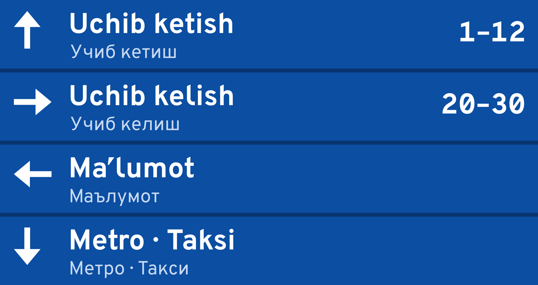
| Signs and wayfinding | readability in capitals, from a distance, and at small sizes; arrows, digits, plate mockups |
| Engineering and licensing | the build, automatic checks, names in the file, compliance with the base's license, accuracy of the text on the font's page |
The checker receives the font, a sample page, and the criteria. What was fixed earlier, and why, is not told to them: this way the eye stays fresh and does not get used to old errors.
What such checking finds
Examples of the comments that checking found in Ipak Davlat:
- The middle dot with no place. In the base, “·” was marked as a mark above the letter and sat on the preceding letter: “5·10” read as “510”. In detail, in the article “A sign read from a distance”.
- I and l, O and 0. On a plate they cannot be told apart from a distance. The tailed l and the set with a slashed zero appeared.
- The substitution in other languages. The English King's turned into Kingʻs. For English, German, French, Russian, and a number of other languages the substitution was disabled, and an exception was made for 's at the end of a word.
- Unmarked text on a website. If the page's language is not given, the browser takes the interface language, and the substitution does not fire. The samples on the portal are marked up as Uzbek.
- Arrows of different width and height. The arrows were drawn anew from one outline, with a common center.
The most insidious errors appear not in the base but in our own fixes. One example is the ng rule. In Uzbek, ng is a single letter, and no ʻ is needed after it at the end of a word: ‘tong’ must not become ‘tongʻ. The first exception for this case proved too broad and broke qoʻngʻiroq, changʻi, and toʻngʻich — the words the substitution exists for. Another example: the tailed l at first replaced the drawing of the l itself, and ĺ ļ ľ and the fl ligature got the tail along with it, and stuck to their neighbors because of it. Now the tailed l is a separate character.
A test on real words
So that such errors do not return, the substitution is checked by a test. It records words as they are typed on an ordinary keyboard, the language of the text, and what the font must show. For example, qo'ng'iroq must become qoʻngʻiroq, ‘tong’ must stay ‘tong’, and the English King's in text marked up as English does not change. The test typesets each word with the HarfBuzz engine — the same one that works in browsers — in both weights and compares the chosen characters with the expected ones.
The rule is simple: every substitution comment that is found becomes a new line of the test, and the test runs after every build.
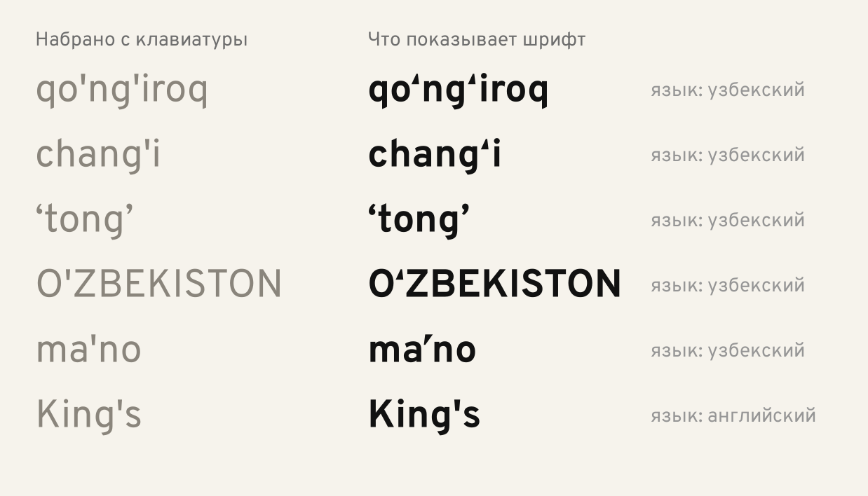
The test also pins a known limitation. A borrowing ending in -g inside quotes, for example 'pedagog', gets a ʻ at the end: by the typed characters it cannot be told from the Uzbek bogʻ. Only a dictionary could tell them apart, and the font does not know one. The test watches that this behavior does not change unnoticed.
Measurement instead of judging by eye
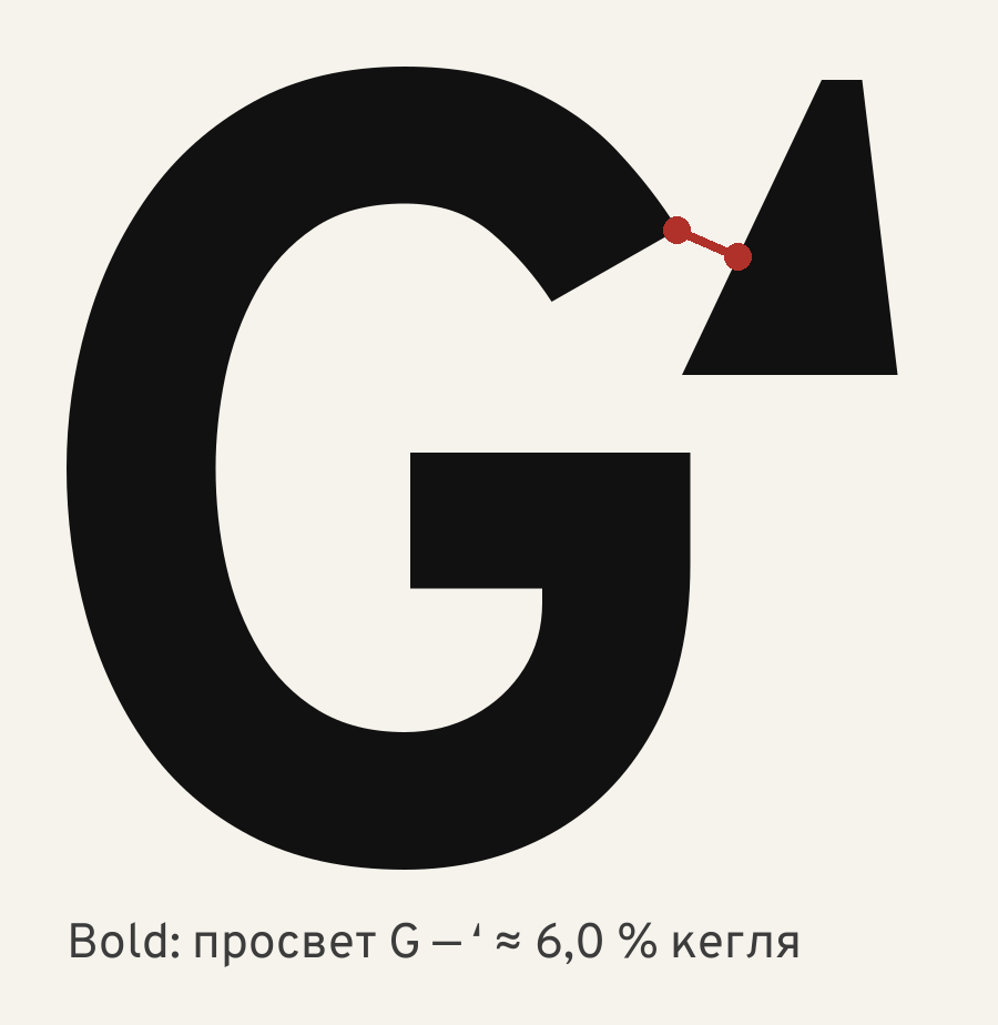
Disputed places are settled with numbers. During checking there was a comment: the ʻ sign almost touches the G, about 1% of the size. Had this been confirmed, the font could not have been released.
The pair was measured. The letters were rendered large into a raster, 2000 units to the size, and the shortest distance between the outlines of the G and the sign was computed. It came out as 145 units in Regular and 119 in Bold — 7.3% and 6.0% of the size. An independent measurement by another method gave close numbers: 7.8% and 7.0%. The threshold proposed in the comment itself is met with a margin. The sign stands close to the G on purpose: it must read as part of the letter Gʻ, not as a separate quotation mark.
The comment was turned down, and the numbers and the measurement method were recorded along with the decision.
The rules that follow from this
- While the font is being checked, the file is not touched. All checkers look at the same build. Fixes go in afterwards.
- Every substitution fix comes with a line in the test.
- The numbers on the font's page come from the font itself. The page is assembled by a script before publication, and numbers such as the count of kerning pairs it computes itself rather than copying by hand.
- Wishes are kept apart from fixes. What does not block the release waits for the next version.
The result
Checking a font is not one examination but several layers: programs catch technical errors, people look at typography, language, plates, and licensing from four sides, a test on real words does not let old errors return, and disputed places are settled by measurement. The most serious errors usually appear in our own fixes — that is why the test and the rule “do not touch the file while it is being checked” matter more than any attentiveness.
Sources
The checking tools: Font Bakery, OpenType Sanitizer (OTS), HarfBuzz; the description of the calt feature — the OpenType specification; the font's base — Overpass. The measurements and the test are our own, on the Ipak Davlat v0.1 build, October 2026.
Links:
- Font Bakery — font checking. https://github.com/fonttools/fontbakery
- OpenType Sanitizer (OTS). https://github.com/khaledhosny/ots
- HarfBuzz — a text-shaping engine. https://harfbuzz.github.io/
- OpenType: the calt feature (Contextual Alternates). https://learn.microsoft.com/en-us/typography/opentype/spec/features_ae#tag-calt
- Overpass — the open base of Ipak Davlat. https://github.com/RedHatOfficial/Overpass