Articles
Articles on how Ipak is made
History, letterforms, the working font and checks. Articles are grouped by the stages of the process; each stage is summed up on the process map.
Stage 1 · The street and the script
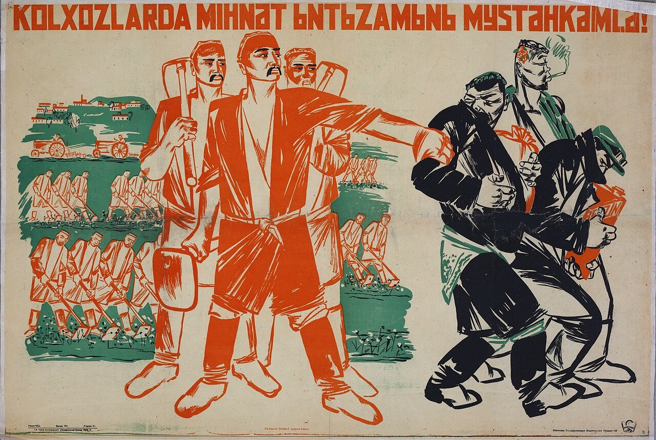
Four scripts in a hundred years
In a single century the Uzbek language replaced Arabic script with Latin, Latin with Cyrillic, and Cyrillic with Latin again — and in 2026 the Latin alphabet is changing once more.

The ʻ sign: what the law says and what Unicode says
The law says that the ʻ sign exists in the alphabet and what it is for, but not what it looks like; Unicode suggests the “6” shape, and the final choice belongs to the font designer.
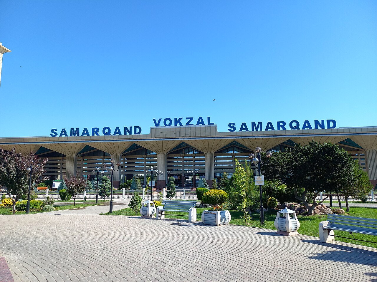
What hangs on the streets of Tashkent
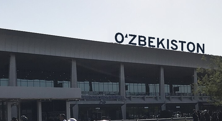
We took apart 17 buildings and signs — airports, railway stations, ministries, a bazaar, the metro — and almost everywhere saw the same thing: a random font placed on top of the architecture.
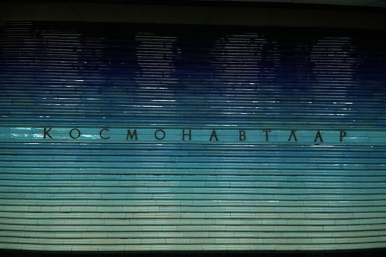
The lettering of the Tashkent metro
There is no single “metro font” in Tashkent: the Soviet stations are lettered in three different styles, three more were added after 1991, and none of them has the Uzbek letters Ў, Қ, Ғ, Ҳ.
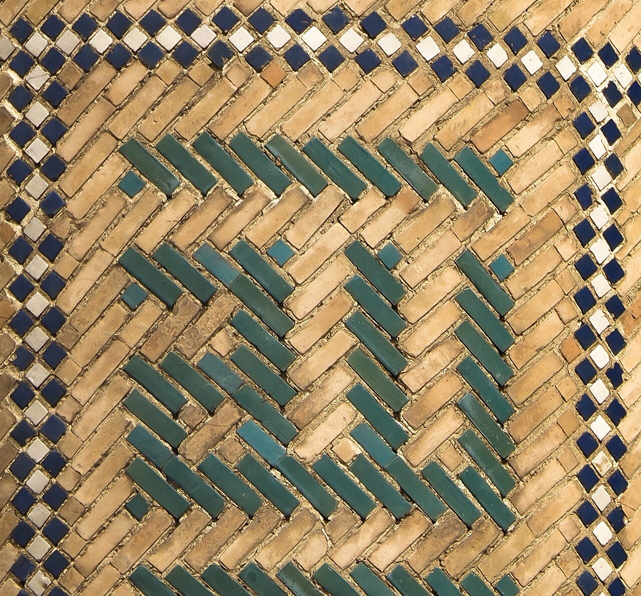
Stage 2 · Form out of craft
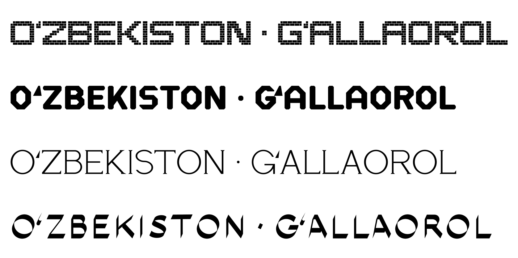
Stage 3 · Accent fonts
Stage 4 · The workhorse font
Why not from scratch
The workhorse font Ipak Davlat grew out of the open Overpass: how we chose the base and what we had to build on top of it for Uzbek.
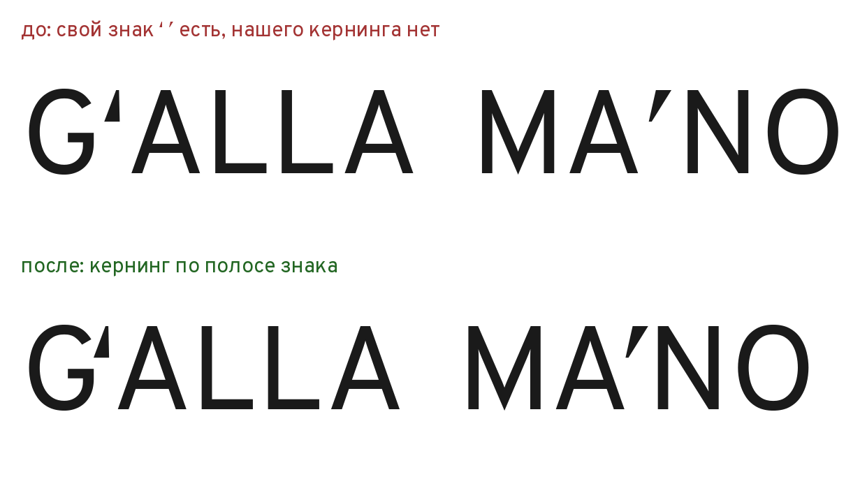
The mark band: aligning Oʻ and Gʻ
Why the word GʻALLA developed a hole, and how we taught the font to measure the gap only where the sign stands.
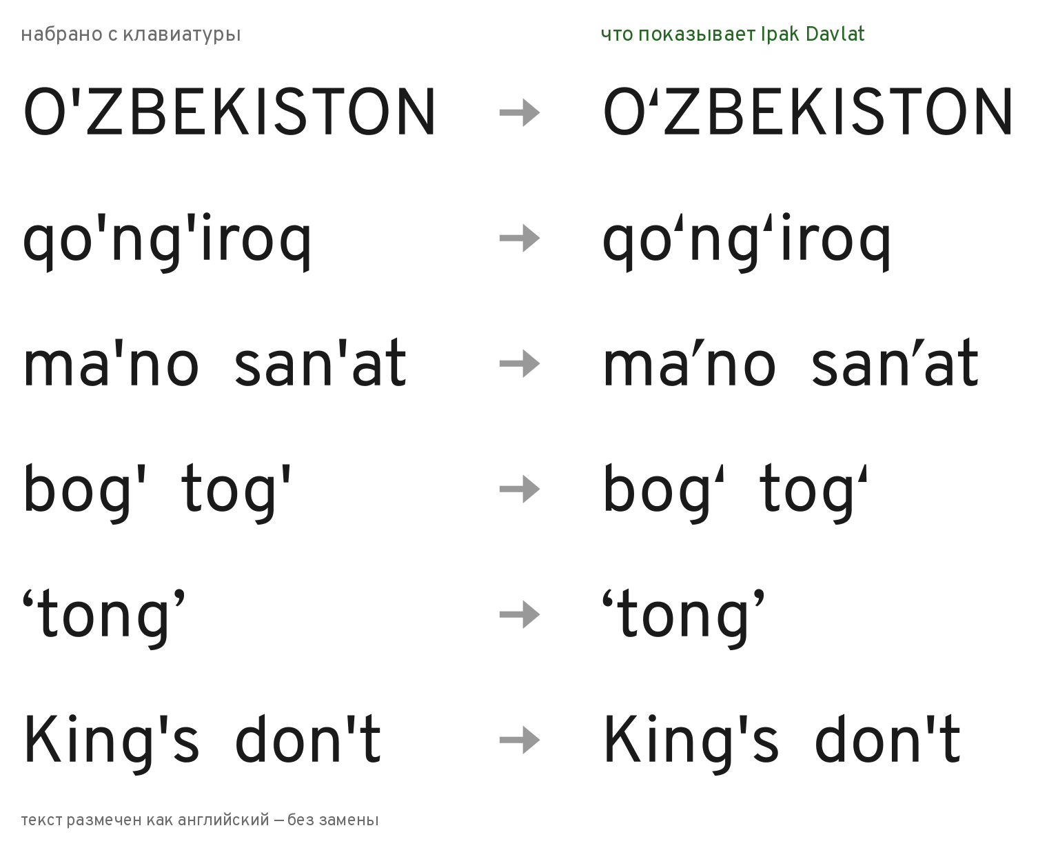
o' → oʻ: a substitution that knows Uzbek
People type Uzbek with an ordinary apostrophe. Ipak Davlat shows the correct signs by itself — and leaves the English King's alone.
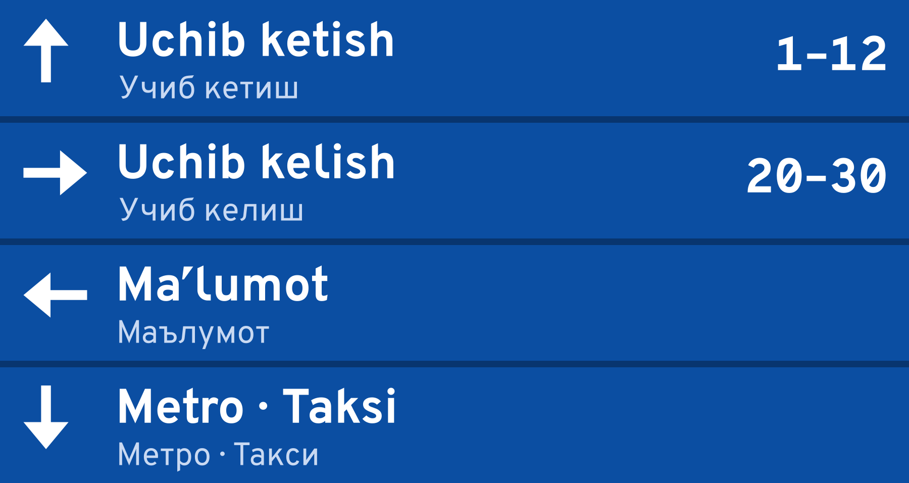
A sign read from a distance
I and l, O and 0, the middle dot, and arrows: the small things that decide whether a plate can be read from the other end of the hall.