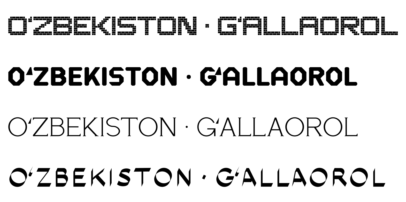
Usually a font is drawn by hand in an editor: the designer places points and pulls curves. The Ipak accent fonts — Bannai, Ganch, Metro, and Kalam — were made differently. Each letter is built by a small Python program following one rule for the whole font. The rule is one, so the weights, cuts, and rhythm match across all the characters — from A to Ҳ and from 0 to №.
This article tells how each font's rule works, how a font file is assembled from the drawn letters, and where version 0.1 still has limits.
First the motif, then the letters
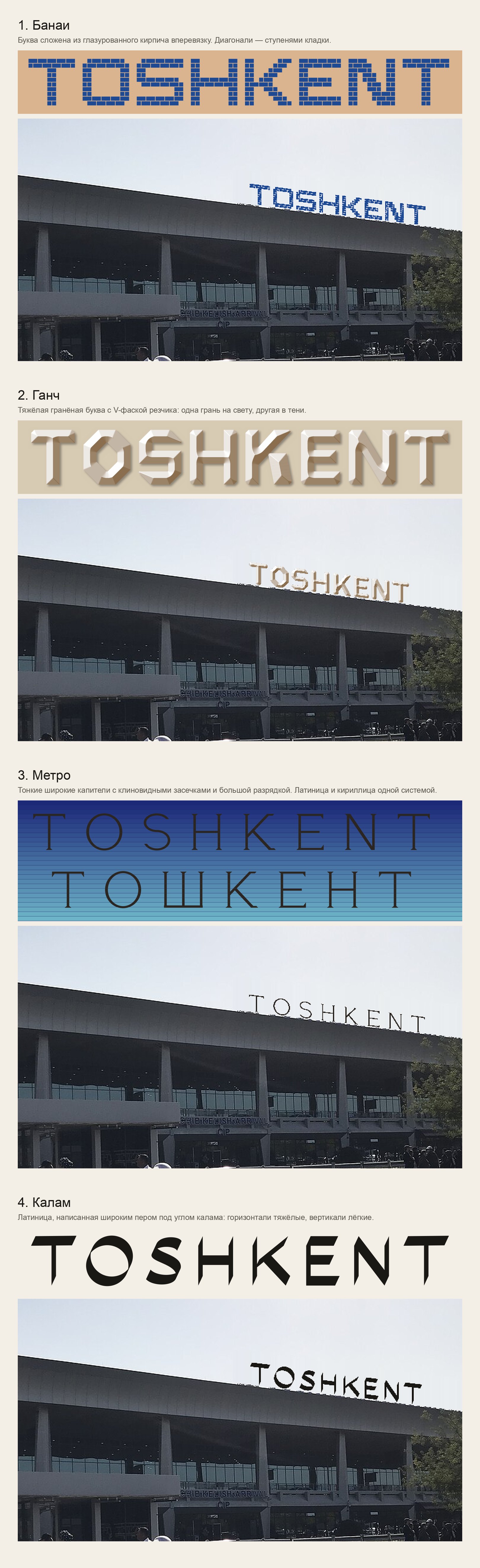
Every accent font begins not with a letter but with a motif that is recognized at first glance: the bannai brick, the carver's knife in ganch, the metal letters of the Tashkent metro, the kalam pen (for the history of these crafts, see the article “Bannai, ganch, kalam”). The motif turns into a rule, and the rule into a program that builds any letter by it.
To compare the motifs in action, the word TOSHKENT was placed on a photo of Tashkent Airport in place of the real sign.
Bannai: bricks in a running bond
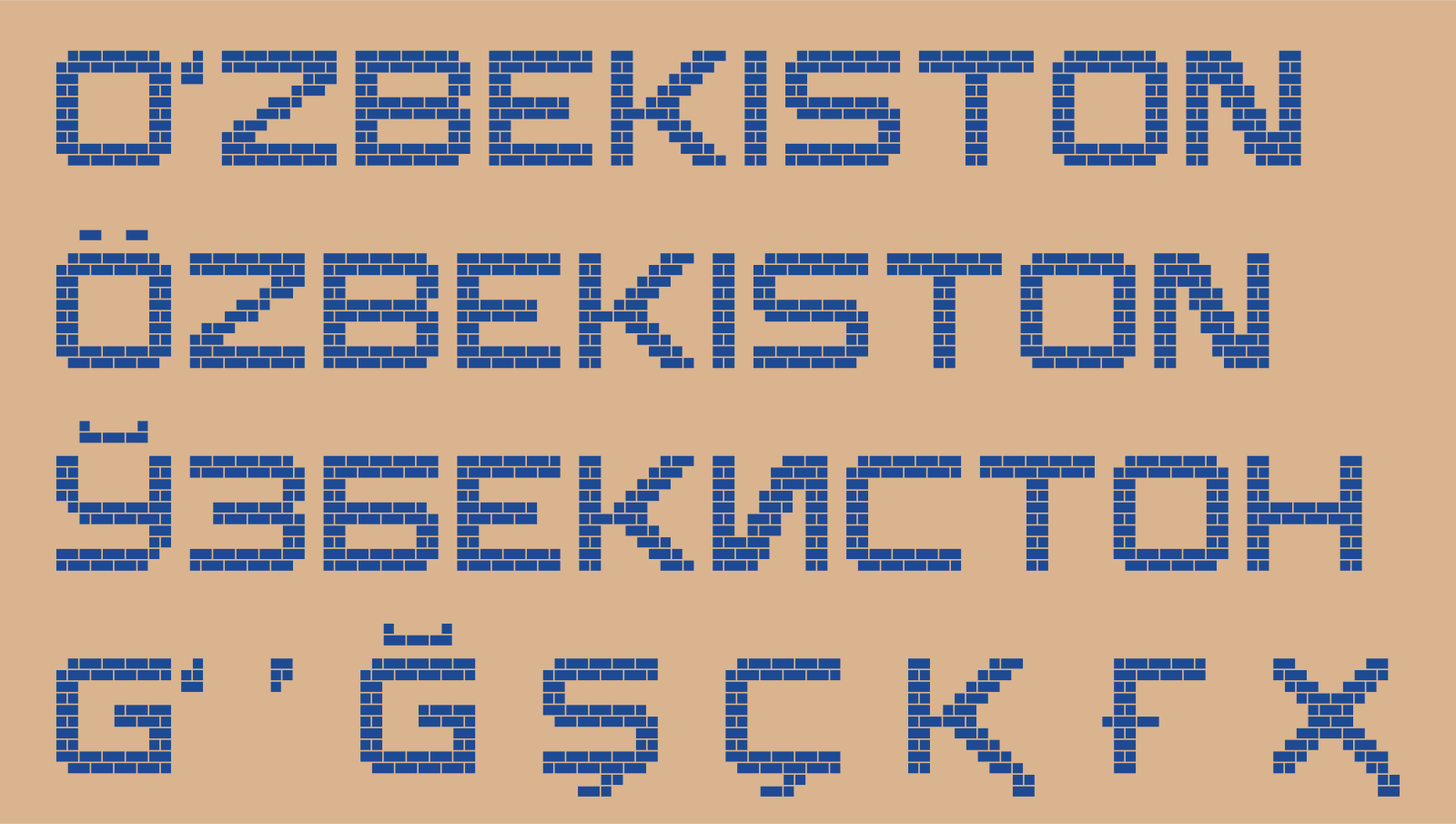
A letter is first written as a picture of cells — rows of grids and dots, as in a squared notebook. A capital takes 10 rows. The cell is square, 70 units. The stroke is two cells; the counter inside the letter, no less than two: this way the letters do not merge at a distance.
Then the program lays the bricks. A brick is two cells, and in the neighboring rows the joints are shifted by half a brick. This is a running bond: the joints of one row do not coincide with those of the next. A 9-unit joint remains between bricks. The diagonal strokes of K, N, Z run in the steps of the brickwork, not as an even slope. The dots of Ö, the breve of Ў, and the ʻ sign sit in the rows above the capital; the tails of Қ Ҳ and the cedillas of Ş Ç, in the rows below the line.
Ganch: the carver's chamfer and light
The outline is built from rectangles and octagons. A vertical stroke is 168 units, a horizontal one 140: this way they look equal. The “round” letters O, C, G, Q are octagons.
The last pass is the carver's chamfer. The program walks the outline and, at every outer corner that is right or sharper (up to 100°), cuts off the point: it steps 40 units along both sides and joins the points with a straight line. At a right angle this is a cut at 45°. The inner corners stay sharp: that is where the knife goes in. The obtuse facets of the octagons are left alone.
The volume is computed separately, from the picture of the letter. For every point inside the letter, the distance to the nearest edge is found. The result is a “distance field”: zero at the edge, larger toward the middle of the stroke. If you picture this field as height, you get a ridge in the middle of the stroke and two slopes toward the edges — a V-cut. Then the program looks at which way each slope faces. The slope facing the light from the upper left gets lighter; the opposite one darkens. On top, a soft shadow is added down and to the right: the letter protrudes from the wall. For a stone wall the same field is inverted, and the letter becomes a recess.

Metro: thin capitals and wedge serifs
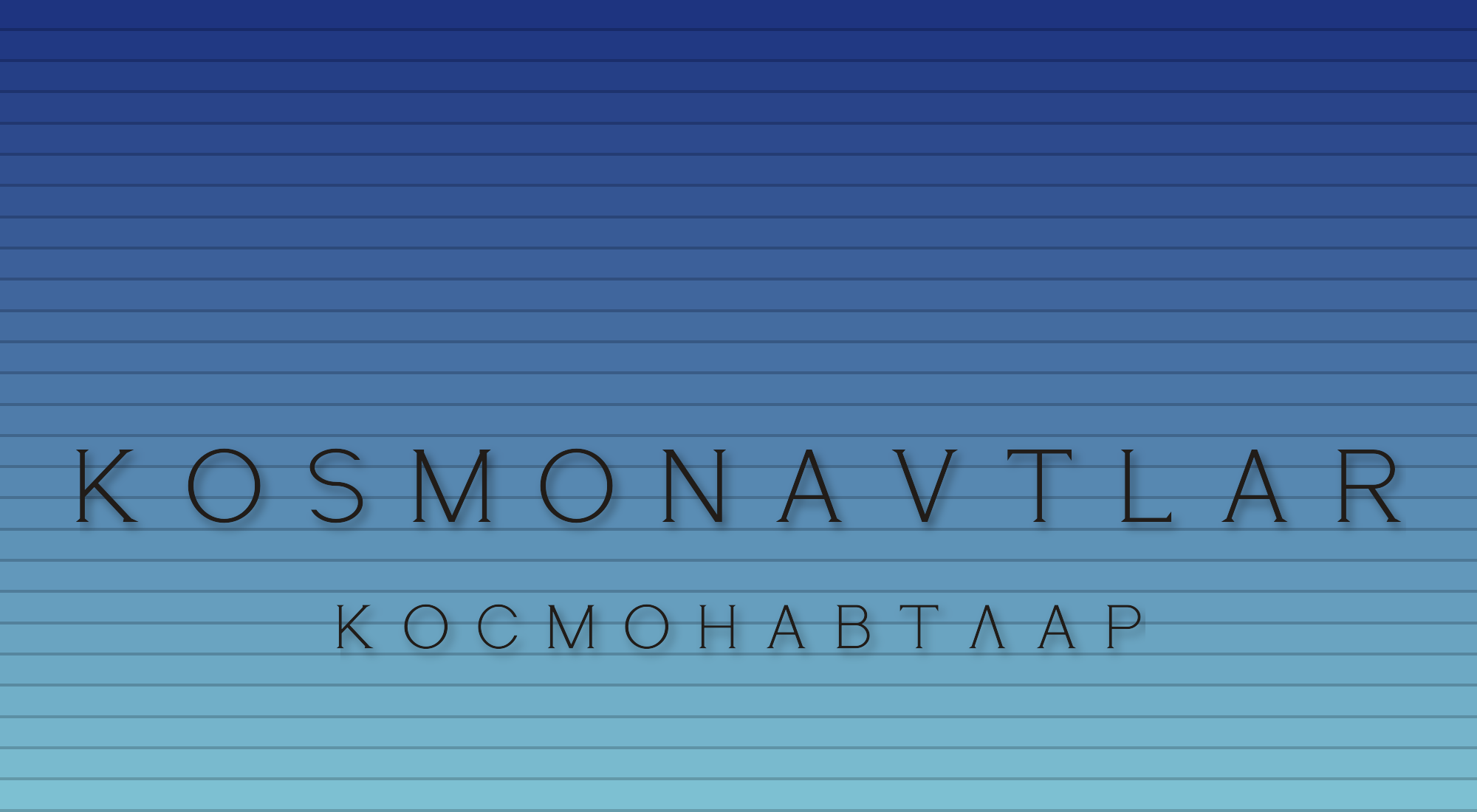
The model is the “КОСМОНАВТЛАР” inscription on the platform of the 1984 station (architects Sergo Sutyagin and Sergey Sokolov). The stroke is thin: 48 units on the main lines, 40 on the horizontals. The letters are wide, about 600 units at a height of 700.
At the ends of the strokes are small wedge serifs. The base of the wedge is wider than the stroke by 40 units on each side; the height of the wedge is 34 units; and the top converges exactly to the edges of the stroke. Words are set with generous letterspacing. The Л is “house-shaped”, as at the station. The drawing is our own, by principle; the Latin is built with the same system.
Kalam: a broad pen at an angle
For each letter a skeleton is defined — a centerline of points. The pen is a segment 150 units long at 65° to the line. The program places the pen at every point of the skeleton, connects neighboring positions into a quadrilateral, and unions all the quadrilaterals. No one sets the thickness: it comes out by itself from the direction of the stroke. At 65° the horizontals are heavy and the verticals light.
If a stroke runs almost along the pen, it thins into a thread. So the diagonal strokes are kept at least 9–10° away from the pen angle: then the thinnest line is no narrower than 25 units. All the characters — letters, dots, digits, punctuation — are written with the same pen.

The ʻ and ʼ signs in every style
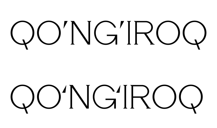
The signs are not taken ready-made from the quotation marks: each is drawn by its own font's rule. One thing is common: the ʻ has its mass at the bottom, the ʼ at the top, so the silhouettes face different ways and are not confused.
| Font | ʻ | ʼ |
|---|---|---|
| Bannai | a “six” of brickwork: a 2×2-cell head at the bottom, the tail up and to the right | the same, rotated 180° |
| Ganch | a wedge with its mass at the bottom, a 10° slant | a wedge with its mass at the top, a 23° slant |
| Metro | a wedge with its base down, the point up and to the right | a wedge with its base up, the point down and to the left |
| Kalam | a gesture of the pen: a hairline from the top down and to the left, a pressured turn at the bottom | the same gesture, rotated 180° |
The sign is pulled close to the O and G by kerning by measurement (more on that below): the ʻ must read as part of the letter, not as a separate quotation mark.
From picture to font
A picture is not yet a font. A font must set letters at the right distances, know the Uzbek rules, and open in any program.
The build. Each style's program returns a dictionary: character, outline, width, side bearings left and right. The build converts the curves to TrueType format, aligns the direction of the outlines, and writes the file through FontBuilder. Lowercase letters map to the same capitals: these are accent fonts, for uppercase inscriptions. The typed ' ‘ ’ ` map to the ʻ and ʼ signs.
Spacing by measurement. The program takes a pair of letters and measures the white distance between them line by line, across the full capital height; deep dips are cut off, because the eye does not look into them. The reference is the average for the pairs HH, HO, OH, and OO of the same font. Each pair is pulled toward the reference, but only halfway: otherwise open pairs like LT stick together. Such a correction for an individual pair of letters is called kerning. Latin is kerned with Latin, Cyrillic with Cyrillic. Digits are not kerned, so that columns of numbers stay even.
The ʻ and ʼ signs — separately. The sign is small and sits at the top, so it is measured only in the mark band — the top 38% of the capital height (in detail, in the article “The mark band”). The ʻ is placed tight against the O and G: 0.45 of the HH gap. After the ʻ — the usual HH gap. The ʼ sits exactly in the middle: 0.8 of the gap on both sides.
The no-touch rule. After all corrections, the program checks the narrowest point of the pair across the full height, including the tails below the line. No pair may come closer than 5% of the size. The correction is capped too: no more than 15% of the size in either direction. Corrections smaller than 20 units are not written.
The Uzbek substitution. People type Oʻzbekiston with an ordinary apostrophe. The font itself changes it to the needed sign, by a rule recorded inside the file; in the OpenType format such a rule is called calt. After an O before a letter — ʻ. After a G — ʻ, including at the end of a word (BOGʻ), but not in the combination ng at the end of a word and not before an s at the end of a word (the English possessive 's). Between two letters in the remaining cases — ʼ, as in MAʼNO. The logic is the same as in the workhorse font Ipak Davlat; see the article “o' → oʻ”.
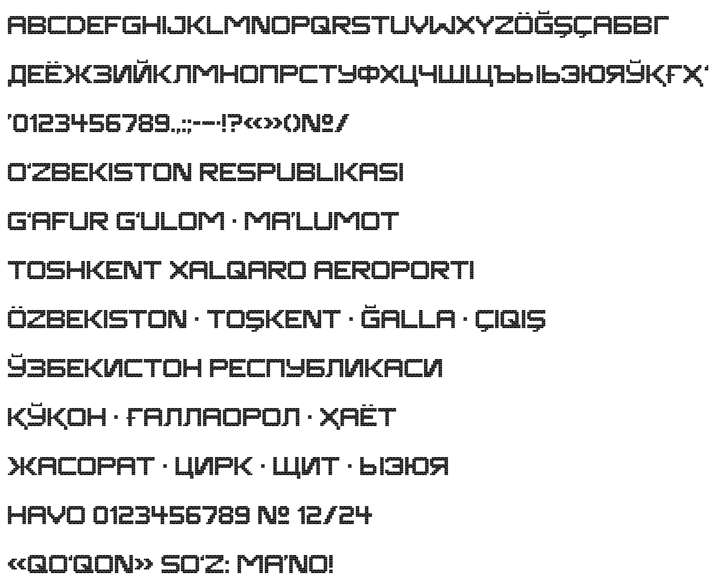
At the end the build prints a proof: the full character set and the control words — OʻZBEKISTON RESPUBLIKASI, ҚЎҚОН · ҒАЛЛАОРОЛ · ҲАЁТ, ÖZBEKISTON · TOŞKENT.
The limits of version 0.1
- Capitals only, one weight. Lowercase is set with the same capitals. There are no other weights yet.
- Bannai is for large inscriptions. The square brickwork is close to a pixel font; it is not meant for plates and small sizes.
- The Kalam pen angle is our own choice. The 65° was chosen by comparing variants on one word; it is not a quotation from a source.
- The distances were set automatically. For a sign, it is worth checking them by eye on the specific word.
- The substitution does not tell languages apart. In the accent fonts the rule works for any text: in the English DON'T, the apostrophe will also become ʼ. For non-Uzbek text, it is worth turning the substitution off in the layout program.
The result
Each of the four accent fonts has 94 characters: Latin with Ö Ğ Ş Ç, Cyrillic with Ў Қ Ғ Ҳ, the ʻ and ʼ signs, digits, and punctuation. All are built by one rule per font and are distributed under the open SIL OFL 1.1 license, like the whole library.
Sources
The description is based on the code that builds the Ipak accent fonts and on the documentation of the tools: fontTools, skia-pathops, SciPy, HarfBuzz, the OpenType specification; for the Metro model, Wikipedia, “Kosmonavtlar (Tashkent Metro)”.
Links:
- fontTools: FontBuilder. https://fonttools.readthedocs.io/en/latest/fontBuilder/fontBuilder.html
- skia-pathops — Boolean operations on outlines. https://github.com/fonttools/skia-pathops
- SciPy: distance_transform_edt — a distance field. https://docs.scipy.org/doc/scipy/reference/generated/scipy.ndimage.distance_transform_edt.html
- HarfBuzz — a text-shaping engine. https://harfbuzz.github.io/
- OpenType: the calt feature (Contextual Alternates). https://learn.microsoft.com/en-us/typography/opentype/spec/features_ae#tag-calt
- OpenType: the kern feature (Kerning). https://learn.microsoft.com/en-us/typography/opentype/spec/features_ko#tag-kern
- Wikipedia: Kosmonavtlar (Tashkent Metro). https://en.wikipedia.org/wiki/Kosmonavtlar_(Tashkent_Metro)