The ʻ sign is small. It sits at the top, at the level of the upper third of a capital letter, and below it is emptiness all the way down to the line. As long as the sign is surrounded by round letters, this is hardly noticeable. But put it between a G and an A — and a hole appears in the word GʻALLA.
This article is about how we dealt with it in the workhorse font Ipak Davlat and why the usual way of aligning does not work here. Distance corrections for individual pairs of letters are called kerning.
Where the hole comes from
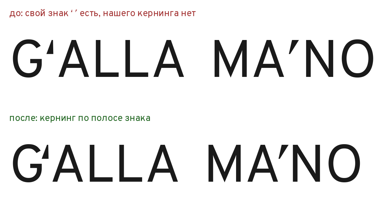
Look at the top row of the picture. The ʻ sign stands apart from the G; then comes another gap up to the A. The A is pointed at the top, and it too gives a lot of air. Three emptinesses add up into one, and the word falls apart into “G” and “ʻALLA”.
The same happens with the tutuq ʼ in MAʼNO: the A is open at the top right, the ʼ is narrow, and the N begins with a vertical stem. Between the A and the N a slit forms, wider than between any other letters of the word.
The type.today review warns about this problem in Uzbek typesetting: the interval between the O or G and the ʻ sign must not be too large, otherwise holes appear in the text.
How spacing is usually set
The computer pair check we wrote for Ipak works the same way as automatic “spacers” — programs that set the bearings. A pair of letters is sliced into horizontal rows from the baseline to the top of the capitals. In each row, the white distance from the right edge of the left letter to the left edge of the right one is measured. The average over all rows is the optical gap of the pair. Optical — because this is how the eye judges it, not a ruler.
Deep recesses, like the inside of an L or under the crossbar of an A, are trimmed: the eye does not look all the way into them.
The reference is the gap of the pair HH. Two straight stems are the simplest case, and we consider the base's bearings correct.
Why this does not work for the sign
The sign occupies only the upper part of the line. Below it there is nothing. If you measure across the full height, the emptiness under the sign gets into the average, and it is large. The algorithm sees a “huge gap” and pulls the sign right up, or even tucks it under the neighboring letter.
Our first version did exactly that: the sign climbed onto the A. We weakened the rule — and the sign “jumped over”: it pressed itself against the A and began to read as its part, not as a part of the G. The reader saw “G ʻA”.
Both errors follow from one cause: the gap was measured where the sign is not.
The mark band
The solution is to measure only in the band where the sign actually stands. In Ipak Davlat the ʻ sign occupies the top 38% of the capital height. That is the band we take.
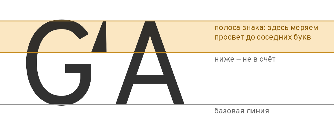
Inside the band you see what the eye sees at the sign's level: the right edge of the G, the sign itself, the left edge of the A. The emptiness under the sign is not counted.
For lowercase letters the band is wider: from the middle of the x-height to the top of the capitals. Lowercase letters are lower, and the sign sticks out above them.
The asymmetric rule
The second discovery: the sign needs different distances on its two sides.
The ʻ belongs to the O and the G. It is not a separate character but part of a letter. So it is placed close to them: the target is 0.45 of the usual HH gap. And up to the next letter — the usual gap, 1.0. This way the Gʻ reads as one letter, and the sign does not “jump” over to the A.
The ʼ separates syllables. It belongs to no one: neither to the left nor to the right letter. So it stands exactly in the middle, a 0.8 gap on both sides.
Two more limits guard against extremes. At its narrowest point, the sign is no closer than 0.4 of the HH gap to its neighbor. And no pair in the font is closer than 5% of the size — this is the no-touch guard. The size is the font's measure; 5% of the size is 5 mm for letters set at 10 cm.
Our measurement before and after, Ipak Davlat Regular, in fractions of the HH gap, in the mark band:
| Pair | Without our kerning | With it |
|---|---|---|
| G → ʻ | 1.16 | 0.69 |
| ʻ → A | 1.12 | 0.99 |
| A → ʼ | 1.21 | 0.80 |
| ʼ → N | 1.10 | 0.81 |
The G and the sign did not reach the 0.45 target — the no-touch guard stopped them. That is by design: slightly too loose is better than sticking together at small sizes.
Cyrillic: the same logic, a different reference
The second half of the work was Cyrillic. In Overpass it was hardly kerned: ГЛ, ТЛ, and УА stood loosely spaced, and for Қ Ғ Ҳ there were no corrections at all.
Here we compared Ipak Davlat with five professional open fonts: Fira Sans, Inter, Noto Sans, Onest, and IBM Plex Sans. An important caveat: we did not copy their kerning values. We measured how tightly each of them sets a pair relative to its own HH, took the median, and tuned Ipak Davlat to it. The median is the middle of a row: half the fonts set the pair tighter, half looser. It does not let one unusual font skew the result.
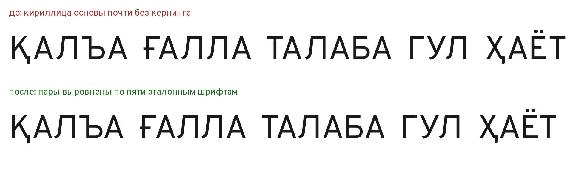
Two rules simplified the work.
Twins. Cyrillic letters that match Latin ones in shape (А, В, Е, К, М, Н, О, Р, С, Т, Х) are set the same way as the Latin ones. The pair КА equals the pair KA. Otherwise the same word would look different in the two scripts.
Tails. A letter with a tail below the line — Қ, Ҳ, Ц, Щ — is set like its base: Қ like К, Ҳ like Х. The tail lies below the line and does not count in the gap.
Here an error happened, caught during checking. The no-touch guard at first measured only above the line, and the tails of Қ and Ҳ nearly touched the neighboring А. The measurement was extended downward, to the tails, and the problem went away.
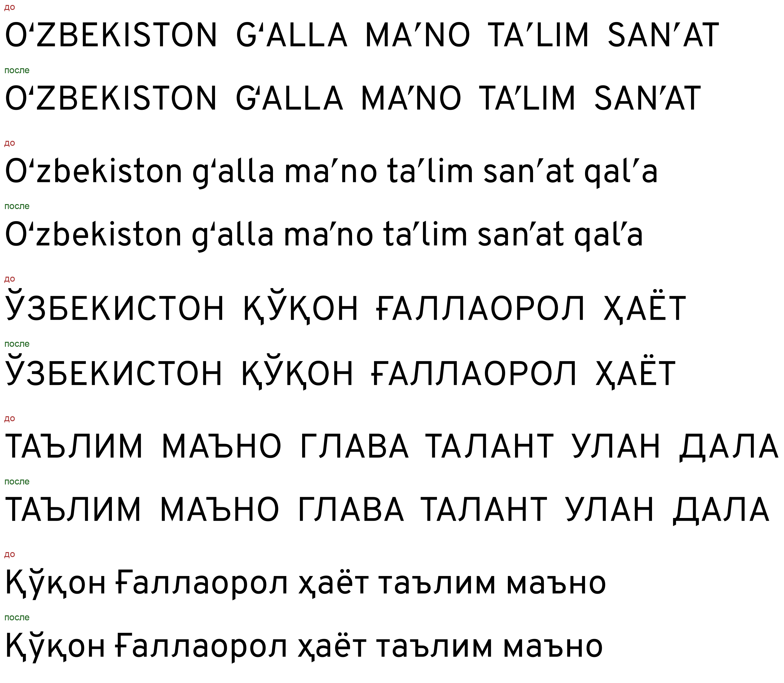
The result: 784 pairs in Regular and 802 in Bold. A detailed “before/after” proof is below.
The dispute about the touching
During checking there was a comment: in Gʻ the sign almost touches the G, about 1% of the size. Had this been confirmed, the font could not have been released.
We checked against the outline: we rendered the pair into a raster where the size equals 2000 points and measured the shortest distance between the ink of the G and of the sign. It came out as 145 units in Regular and 119 in Bold — 7.3% and 6.0% of the size. An independent measurement by another method gave 7.8% and 7.0%. The threshold proposed in the comment itself, 60–80 units, is met with a margin. The comment was turned down with numbers. The closeness of the sign to the G is not an error here: it is by design, so that the Gʻ reads as one letter.
What follows from this
The ʻ sign is not a quotation mark, and it cannot be aligned like one. Three conclusions useful to anyone making a font for Uzbek:
- The gap must be measured where the sign stands, not across the full height of the line.
- The ʻ leans toward its own letter, the ʼ stands in the middle: the rule is asymmetric.
- The no-touch guard matters more than a pretty number: at small sizes, sticking together is worse than extra air.
Sources
- The advice about the gap between O/G and ʻ — А. Шайдуллина, type.today, 04.12.2023.
- The names and numbers of U+02BB and U+02BC — the Unicode chart Spacing Modifier Letters.
- The description of the kern feature — the OpenType specification, Microsoft Typography.
- The method and the numbers are ours: the measurement was made with HarfBuzz and FreeType on the Ipak Davlat v0.1 build, October 2026.
- The reference fonts: Fira Sans, Inter, Noto Sans, Onest, IBM Plex Sans (all under SIL OFL 1.1).
Links:
- А. Шайдуллина. Uzbek. type.today, 04.12.2023. https://type.today/en/journal/uzbek
- Unicode: Spacing Modifier Letters (U+02B0–U+02FF). https://www.unicode.org/charts/PDF/U02B0.pdf
- OpenType: the kern feature (Microsoft Typography). https://learn.microsoft.com/en-us/typography/opentype/spec/features_ko
- HarfBuzz — a text-shaping engine. https://harfbuzz.github.io/
- Fira Sans. https://github.com/mozilla/Fira
- Inter. https://github.com/rsms/inter
- Noto Sans. https://github.com/notofonts/latin-greek-cyrillic
- Onest. https://github.com/simpals/onest
- IBM Plex. https://github.com/IBM/plex